If you’ve spent time around the Ethos3 blog, you know we believe in visuals over bullets and that we have the science to back it up. We’ve all drooled through a data-heavy presentation where our eyes began to tire and the facts and figures all begin to run together. While these decks are full of great information, odds are the audience is disconnecting from the content, which means they’re not retaining the information.
Experts have found that compelling visuals can increase information retention by nearly 42%. That’s why creating visually engaging data slides is a powerful tool to increase retention and improve your audience’s engagement.
But when it comes to creating engaging visuals, it’s hard to know where to start. That’s why we have put together 4 traditional visuals that you can create along with some tips about when to use them.
Pie Chart
A pie chart is a circular statistical graphic which is divided into slices to illustrate numeric proportions. This layout is best used when presenting large scale percentages. It is especially compelling when you are showing a large gap in the information.

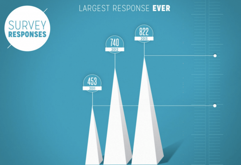
Pictorial Chart
A pictorial chart is a visual representation of data by using pictograms. It uses icons or pictures in relative sizes to highlight the data pattern and trends. This layout is best used when illustrating tangible data. By using pictograms to represent the data, you will bring the data to life.
Line Chart
A line chart or line graph is a type of chart which displays information as a series of data points called ‘markers’ connected by straight line segments. This layout is best used when presenting a highly professional presentation. Line charts are a great way to compare data points and trends over the course of time.

Bar Chart
A bar chart or bar graph presents categorical data with rectangular bars with heights or lengths proportional to the values that they represent. Similar to the pie chart, the bar chart is best used when presenting large-scale numbers. Bar charts are especially impactful when you are trying to show how close or how far apart simple data is.
 Presenting your data in a visually compelling layout ensures that you experience the largest retention and engagement rate from any audience. By simply implementing these four charts, you will find that your presentation not only becomes more engaging, but it will be one that your audience remembers and connects with long after you have finished presenting.
Don’t have time to worry about your design? The team at Ethos3 can help. We would love to create a beautiful and engaging presentation for you so that you can focus on what matters. Contact us today to find out how we can help.
