An important part of presenting is knowing how to direct and manage your audience’s attention. This isn’t just something you do with engaging eye contact or compelling stories. It’s something that you need to weave into your slide design as well. So let’s look at how to help your audience navigate your slide deck more easily and efficiently. We’ll cover 3 common mistakes presenters make, along with 2 design tricks you can use to help direct attention.
3 Common Mistakes
1. Putting Too Much On the Slides
A busy slide is a bad slide. Cole Nussbaumer Knaflic, author of Storytelling with Data, says, “clutter can create excessive cognitive load because the processing of it takes up mental resources, but doesn’t aid in understanding.” So when it comes to creating your slide deck, less will almost always be more. When you have too much clutter on the screen, your audience doesn’t know where to look, and they can easily become overwhelmed trying to get through all the content. And in the meantime, if you are talking, they aren’t paying attention to you.
2. Putting Everything on the Slide at Once
Like a great story, a slide should unfold. As soon as you put content on the screen, the audience begins examining it. Say you have 3 things to cover. If you put them all up at once, they will immediately start reading through all 3 things even if you won’t get to the third thing for another 5 minutes or so. Again, you’ve lost the audience’s attention because they are reading ahead.
3. Relying More on Words Than on Visuals
The role of a slide deck is to communicate something that words can’t. Save the words for what you say to the audience. Use your slides, on the other hand, to show them what you need them to see. This will also help the audience remember your presentation better because research tells us that linguistic and pictorial memory works differently.
Now that you know 3 common problems to avoid, let’s look at 2 simple design tricks to solve these problems.
Design Trick #1: Introduce Elements One-By-One
As a presenter, you want your audience to keep pace with you. They shouldn’t be ahead or behind. One way to control is this is to release just a little bit of information at a time. Look at the slide below. It shows the 3 problems this presenter will be covering.
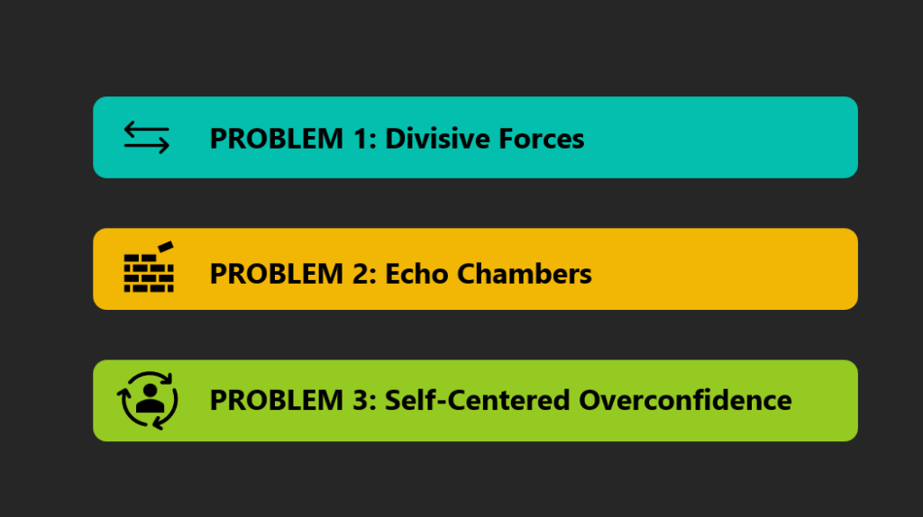 If you show all 3 problems at once, you aren’t controlling the attention of your audience. Plus, they might get distracted during your message. Which one is he/she talking about right now? To fix this, you’ve got a couple of options:
1. Only show 1 rectangular box at a time. This is the cleanest visual option and maximizes audience attention. Here’s how to set this option up:
- Make each item a group. So for the first group, I will hold down SHIFT while I select the arrows icon, the teal box, and the “problem 1:” text and click CNTRL + G to group them.
- Then, I’ll go into my Animations menu.
- From here, I chose the “Fade” option and set it to start “on click.”
2. Keep the colorful rectangular boxes on the screen at all times, but only show the icons and words for each point as you get to them. This is a good option if you want the audience to know how many points you are covering without revealing content ahead of time. To set up this option:
- Group only the icons and text for each group. So for the first problem, I don’t select the teal box, but I hold down SHIFT while I select the arrows icon and the text. Then I click CNTRL + G to group just the two elements.
- Repeat this for groups 2 and 3.
- Then, I head back to the Animations menu.
- Click on each colored rectangle and make sure the animation is set to none. That means the blank colored boxes will appear as long as I’m on that slide in the presentation.
- From there I’ll follow the same sequence as above, setting the icons and text groups to fade in when I click them.
Watch this quick video to see what the slide looks like with no animation, with full group introduction, and with icon/text only introduction.
Design Trick #2: Use Transparency to Highlight Elements
In some cases, you may want your audience to be able to see all of your main points or concepts on the screen at all times, unlike above. But you still want to direct their attention to the point you are currently covering. In this case, you can use transparency to make some elements appear dim or dark. This way, you direct the audience’s attention to the item that is in full color.
To do this:
- Create 3 identical slides with all 3 of your groups in full color. You can see the 3 slides you’ll end up with in the slide sorter on the left of the picture below.
 For each slide, make sure all of the elements for each group (colored rectangle, icon, and text) are grouped together.
- Make sure there is no animation on any of your slide elements.
- Then, click on the first colored rectangle that you want to “dim” out. Go into the “Format Shape” menu and adjust the transparency of the group. I set it to 80% transparent here. (See right menu box in the image above.)
- Repeat this for the second group you want to dim out on the first slide. Then repeat these steps on the next two slides, dimming out the groups that aren’t the focus of that slide.
You’ll end up with a presentation that looks like this.
It’s these types of simple fixes that can take your presentations from cluttered and overwhelming to clear and concise. By either introducing elements one-by-one or using transparency, you can help to focus your audience’s attention.
For more presentation design tricks, check out our blog. Or, get in touch with us to see how we can help with your next big presentation.
