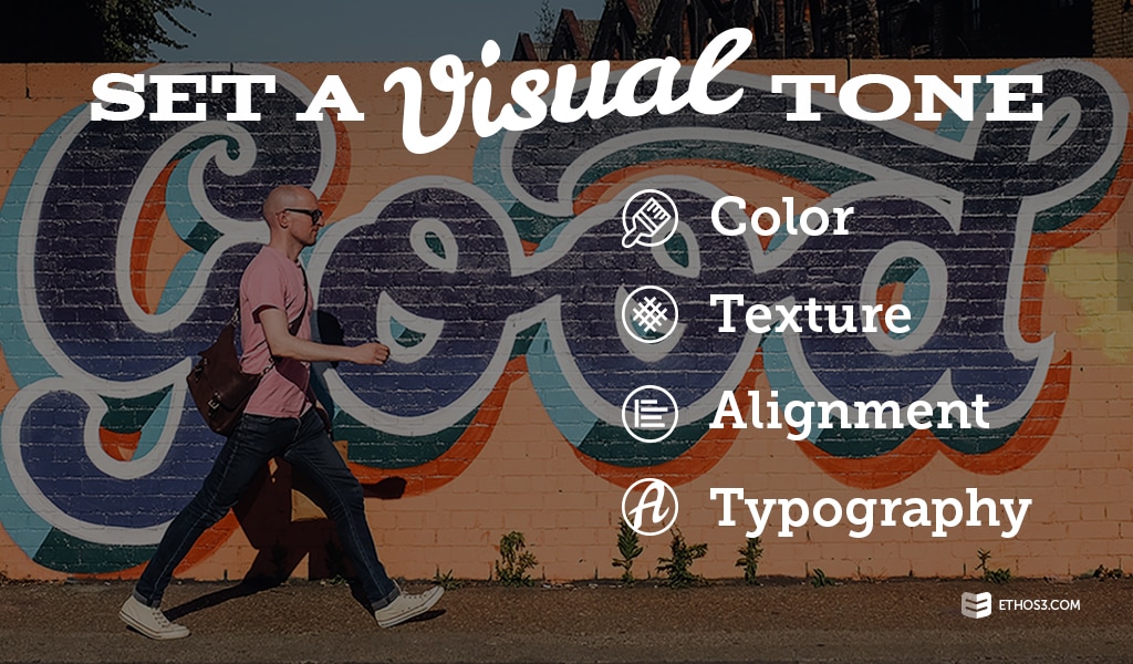
When people think about establishing a presentation tone, oftentimes, the discussion turns straight to the textual content. While choosing a narrative theme that sets the tone you want for your talk is important, neglecting the impact of visual elements on your presentation design can be fatal for your messaging. Just as content creators use certain adjectives or verbs to charge a phrase with emotion and project a particular tone, designers use color, texture, alignment, and typography. Learn more about these essential tools and how to best maximize their tone-setting potential:

1. Color
At Ethos3, our designers suggest that presenters stick to 3 color choices, 4 max, within their deck. Through the selection of a base, background, and accent color, the designers create harmony on your slides – intentionally weighing the balance of brightness, readability, and various other design factors. It’s indisputable that color influences emotions – for example, darker shades of red evoke anger, while mid-to-dark blues signify calmness and wonder. Let’s say you hit your department hit their quarterly goals. At the next staff meeting, inject yellow into the presentation design color scheme to set a joyful tone.
2. Texture
To create texture, a designer might use photography, illustrations, or even text. Texture can be used to emphasize a specific component of the slide or an important piece of information. For example, if you are presenting to a group of college students about the Legal Services Department at the university, include a map of the establishment’s location with a different texture to indicate the actual building. The texture could be designed using lines and shapes.
3. Alignment
If the tone of your presentation is dynamic and progressive, consider varying text alignment to produce movement on the slide and the overall deck. For a more professional or sophisticated presentation, you’ll probably align your text to the left or the right or a varied approach with each slide changing text alignment. A presenter delivering a talk about the history of racing in European countries might benefit from a varied alignment between text and images to evoke a vibrant tone.
4. Typography
Although text might be minimal if your presentation design is more simple, clean, and modern, typography remains a powerful conveyor of the overall tone of your message. For example, if you are aiming to fashion a more conservative or professional tone throughout your presentation, use Baskerville for section headers and slide titles. Heading down a more creative route? Our designers suggest using a font called Ribbon.
Bringing It All Together
Before you begin working on your presentation, pick the tone you want to convey. Move forward by writing content that further forms the tone. And then use color, texture, alignment, and typography to complement the text and maintain the tone. To discover more about presentation design and delivering the right message to your audience, check out the following articles:
How to Use Color Wisely in Presentations
