Do you find yourself spending way too much time settling on a font for your presentation? Or perhaps you’re tired of the ol’ standbys and want to see what else is out there only to be overwhelmed by the choices. Fonts and typography can be visually impactful once fully mastered. By definition, Typography is the art and technique of arranging type to make written language legible, readable, and appealing when displayed. Stretching far beyond lettering, typography is also applied to the style, arrangement, and appearance of letters, numbers, and symbols. It’s important to have a base knowledge of terminology as well as anatomy of these letters, numbers and symbols in preparation for maximum efficacy.
Typeface vs. Font
While the words typeface and font are often used interchangeably, there is a distinct difference between them.
Typeface is the design, style or shape of letters. A typeface is often part of a type family of coordinated designs. The individual typefaces are named after the family and are also specified with a style designation, such as italic, bold or condensed.
Font refers to the file or digital file-type, or the physical letters used in letterpress. It comes in a wide range of variable styles like weights or italics.
A typeface is made of fonts. For example, Futura is the typeface, while Futura Bold is a font within that typeface family.
Text Anatomy
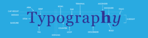
Another place to start is understanding the anatomy of text. It’s important to understand the elements from which typography is made. Take a look at this diagram, then we will define each element below.
Glossary of terms
If you’re still feeling out of your depths seeing each of the elements that goes into a font, you’re not alone. Here are the terms broken down:
Alignment-The positioning of text within the page margins. Alignment can be flush left, flush right, justified, or centered. Flush left and flush right are sometimes referred to as left justified and right justified.
Ascender-The part of lowercase letters (such as k, b, and d) that ascends above the x-height of the other lowercase letters in a face.
Baseline-The imaginary line on which the majority of the characters in a typeface rest.
Body text-The paragraphs in a document that make up the bulk of its content. The body text should be set in an appropriate and easy-to-read face.
Condensed-A narrower version of a font, used to get a maximum number of glyphs into a given space.
Descender-The part of lowercase letters (such as y, p, and q) that descends below the baseline of the other lowercase letters in a font face. In some typefaces, the uppercase J and Q also descend below the baseline.
Display font-A font that has been designed to look good at large point sizes, often for use in headlines.
Family-Also known as a font family. A collection of faces that were designed and intended to be used together.
Italic-A slanting or script-like version of a face. The upright faces are often referred to as roman.
Kerning-The adjustment of horizontal space between individual characters in a line of text.
Leading (pronounced: ledding)-The amount of space added between lines of text to make the document legible.
Margin-The white spaces around text blocks.
Point size-The common method of measuring type size.
Style-One of the variations in appearance, such as italic and bold, that make up the faces in a type family.
Symbol-A category of type in which the characters are special symbols rather than alphanumeric characters.
Tracking-The average space between characters in a block of text. Sometimes also referred to as letterspacing.
Weight-The relative darkness of the characters in the various typefaces within a type family. Weight is indicated by relative terms such as thin, light, bold, extra-bold, and black.
White space-The blank areas on a page where text and illustrations are not printed. White space should be considered an important graphic element in page design.
Width-One of the possible variations of a typeface within a type family, such as condensed or extended.
X-height-Traditionally, x-height is the height of the lowercase letter x.
Now that you’re familiar with some terms, you can better understand why different fonts exist. While crucial in capturing the correct mood of any design, typography also makes all the difference in messaging. Font usage can impact messaging, conveying your text as modern or traditional, fun/energetic or serious, casual or corporate, etc. We encourage that as you get to know your message, you envision the type of font that may be appropriate for your next presentation. Be on the lookout for a blog next week diving in to pairing fonts as well as the four main categories of fonts! In the meantime, feel free to reach out for questions, a quote, or to meet one of our presentation mentors!
