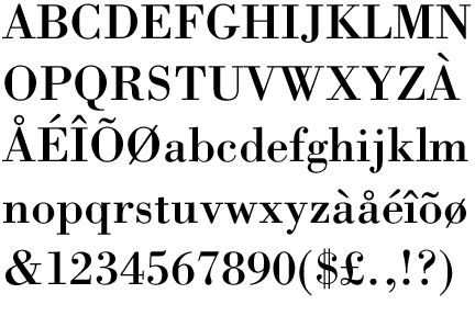
I thought I would spend today providing a brief history lesson regarding fonts. Today, the focus will be on one particular font – Bodoni.
According to Wikipedia, “Bodoni is the name given to a series of serif typefaces first designed by Giambattista Bodoni (1740–1813) in 1798. The typeface is classified as didone modern. Bodoni followed the ideas of John Baskerville, as found in the printing type Baskerville, that of increased stroke contrast and a more vertical, slightly condensed, upper case, but taking them to a more extreme conclusion. Bodoni’s typeface has a narrower underlying structure with flat, unbracketed serifs. The face has extreme contrast between thick and thin strokes, and an overall geometric construction.”
Bodoni is described as the “The son of a master printer, [who] held to four principles from which a good typeface derives its beauty: uniformity of design, smartness and neatness, good taste, and charm.”

