Whether you’re a new presentation designer or a seasoned pro, I’m sure you’re familiar with the impact that color can have on a design. Today we’re going to look at the 7 best color combinations for your next presentation design.
Color evokes emotion. It can inspire, create intrigue. Because color can be so influential, color is one of the most powerful tool at your disposal as a presentation designer.
With almost 18 million colors out there, the color scheme options for your next presentation are just about infinite. But don’t worry. We’re here to help.
Foundation: Color Theory and Color Wheel
If you’re just looking for colors, you can scroll on – but if you really want to understand the why behind each of these color schemes, keep reading.
Color theory
What is Color Theory, well the IDF says that “Color theory is the collection of rules and guidelines which designers use to communicate with users through appealing color schemes in visual interfaces.”
In basic terms – Color Theory is the science of using color to communicate.
Color wheel
Did you know that Isaac Newton invented the color wheel? When he was 23… While that makes me feel like a failure on a personal and professional level, I’m truly grateful he created it. Here’s why:
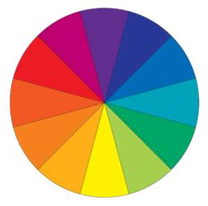
Newton understood how color was defined by human perception and how it came together to create eye-catching combinations, resulting in him creating the primary, secondary, and tertiary color categorizations:
Primary colors: red, yellow, blue
Secondary colors: orange, green, violet (created by mixing primary colors)
Tertiary colors: red-orange, yellow-orange, yellow-green, blue-green, blue-violet, red-violet (created by mixing both primary and secondary colors)
To get started, let’s split the color wheel in half. You’ll start to notice that there is a distinction between warm colors (reds, oranges, and yellows) and cool colors (blues, greens, and violets).
Warm colors typically convey sentiments of energy, brightness, or life whereas cool colors convey sentiments of calmness, grounding, or serenity.
Color Combinations
There are three basic color combinations that you need to understand.
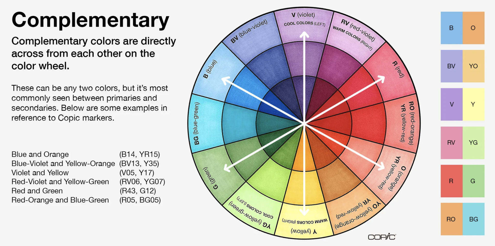
Complementary Color Combinations are the colors that sit on opposite sides of the color wheel. Combining these colors creates an effect of high contrast. Due to the high levels of contrast, they’re typically pretty eye catching.
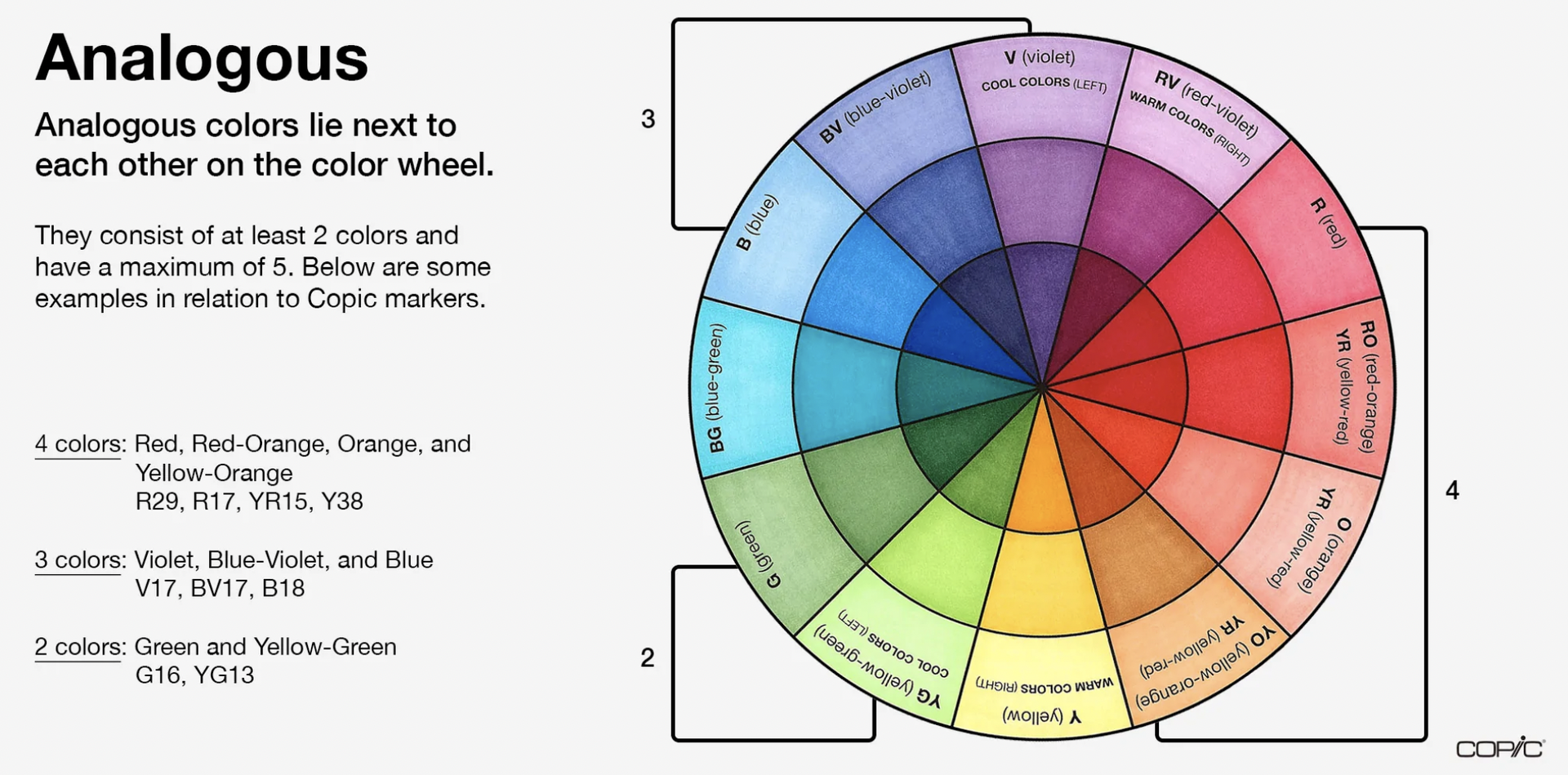
Analogous Color Combinations are every two to five colors that sit beside each other on the color wheel. These color combinations create a sensation of balance. Typically one of these colors sits in the background, while the other more dominant color sits in the foreground.
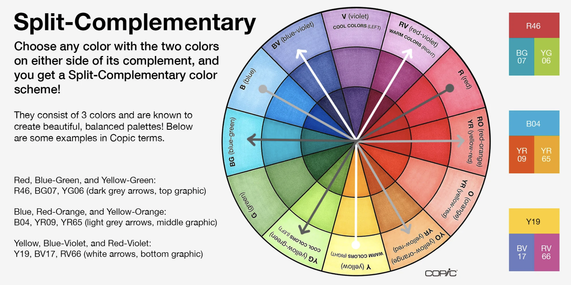
Triadic Color Combinations or Split-Complementary are spaced evenly throughout the color wheel and tend to be more rich or vibrant in color. This color combination is typically dynamic, creating a harmonious visual contrast that pops when combined. Create a triangle on the color wheel and you’ll find your 3 triadic colors.
Understanding the universal perceptions and relationships of colors is key to being a great artist or designer.
So here’s our list of the 7 best color combinations for your next presentation design.
Note: Naming colors is less of a science than color theory is, so we took inspiration for OPI’s nail polish names and went a little wild with these.
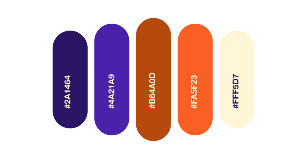
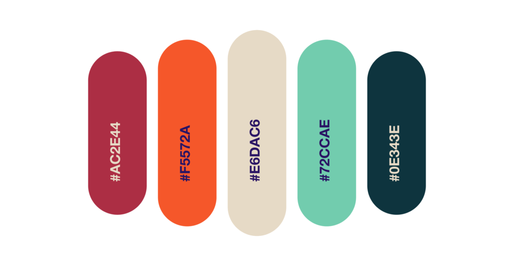
1. The “Hip Tech” Combination
Once you start looking for these purples mixed with these oranges, you’ll notice them all over the place. And for good reason, they look great together!
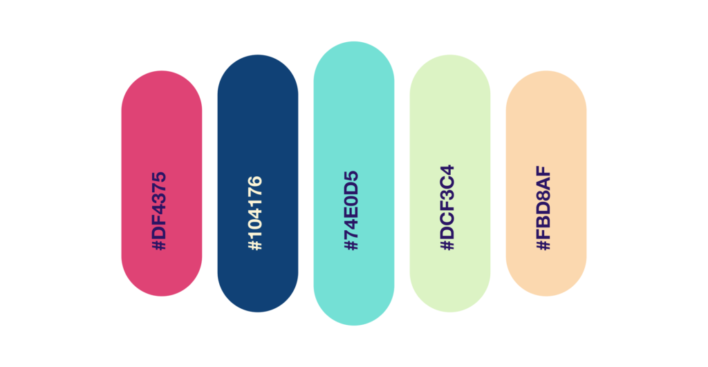
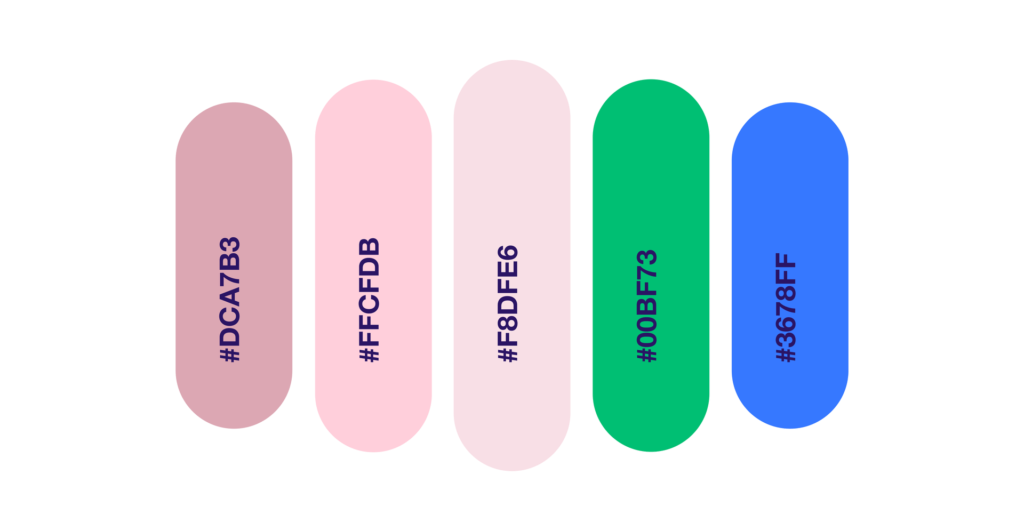
2. The “Fun at the Beach” Combination
Definitely a bit more playful than the first, but we’re expecting to see more and more pastels come into play in 2023, so don’t be surprised if you start seeing #DCF3C4 show up in a pitch deck near you.
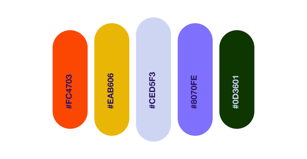
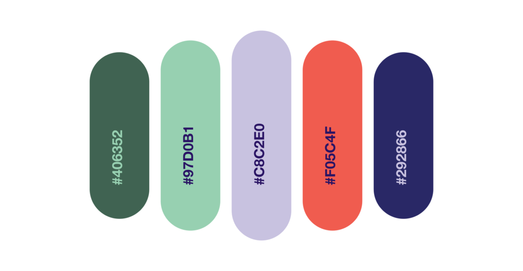
3. The “Australian Summer” Combination
A pitch deck? Sales demo? New branding guidelines, our team loves this color set and we think you should too.
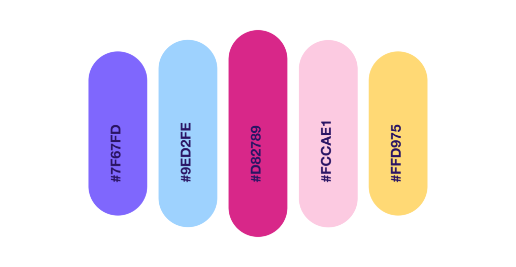
4. The “Gen Z’s Easter” Combination
As we mentioned, pastels are coming back in a big way. And we think the Gen Z’s Easter could really take flight.
5. The “Cool April Nights” Combination
Is it just me or do you want to bust this out on your next deck, illustration, and re-paint that boring room in your house all of these colors?
Just me? Ok.
6. The “Logistics Company but Cooler” Combination
I’m going to say it – if you’re a company that does logistics or you’re a new map app, I’ve almost completed your new branding for you. That green and blue with those pinks, you’re welcome.
7. The “This Presentation is Going to Win a Prize on Behance” Combination
We believe in saving the best for last – and while there’s a bunch of winners on this list – I think the diversity of this color combination along with where design in 2023 is going- this could be the winner.
If you’re curious what a team of professionals could do with any of these color combinations or with your brand guidelines, let us know! We’d love to work with you on your next deck!
