Like all the crazy mnemonic devices you came up with to make it through the SAT, images and visuals in presentations can help your audience understand the point of a complex message rather easily.
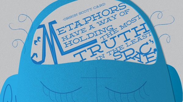
A good visual metaphor will be comparative: the point is to give the audience a picture of something that is familiar so that they can attach meaning to the message that isn’t familiar.
Let’s imagine you’re in an IT department, trying to convince senior managers to invest in a certain infrastructure update that is critical to the overall health of the system—let’s say it helps identify threats and hackers. It’s one thing to tell a non-technical audience of senior managers that failing to update the component would be a disaster. It’s another thing to say that failing to update the component would be like taking the radar out of a fighter jet, and to pair that analogy with an image of a crashing jet or a fighter pilot having to eject from the cockpit.
The metaphor takes the technical concept and makes it digestible for a wider audience; the visual makes it stick. Images and metaphors work well together in this fashion, and they have the added benefit of filling in your presentation with something more entertaining to follow than bullet-points and text.
Of course, the concept works for larger themes and ideas, too. Bold, dynamic, full-slide imagery (1024 pixels wide x 768 pixels high) can carry a lot of aesthetic weight in a presentation, and compared with more advanced design techniques and competencies like typography, gradients, custom illustrations, and color theory, pictures are easy to employ for even a novice presentation artist.
The big keys when relying on visual metaphors to get a message across have to do with image selection. Try to avoid the “cheesy” stock photos out there—usually, this means anything with too-perfect, too-attractive people smiling at the camera, or smiling in a meeting. Visual metaphors do need to be metaphors, so a lot of times people won’t be the focus of the image, though they may be a part of it. The adage, “a picture is worth a thousand words” is only partially true in this case: some pictures really do say something. Some don’t. You’re job is to be selective enough and precise enough with your themes and ideas that the pictures you select really do cover some ground, content-wise.
The next time you’re developing a presentation, take a macro-view of the presentation and ask yourself if some visual metaphors scatter throughout might enhance the visual appeal and make certain key points a little more relatable to people who might not otherwise understand.
Question: How do you use imagery to improve the overall communicative value of your presentations?

