Data isn’t knowledge. It doesn’t say much. At least not at first. Not until someone with skill and creativity take those numbers and to turn it a story. Into something the audience can understand. Into what we call a data visualization. And yet we see far too many presentations in which a speaker throws a chart or graph up on the screen and assumes two things. First, that it is developed to communicate well. Second, that the audience can understand it. But too often one or both of those things aren’t happening.
Last Monday in the blog 2 Presentation Mistakes to Avoid, I referenced a great book. One that all presenters should have in their library. It’s Cole Nussbaumer Knaflic’s, Storytelling with Data. In it, she says, “Good data visualization—infographic or otherwise—is not simply a collection of facts on a given topic; good data visualization tells a story.”
So today we’ll be covering some tips from Knaflic and other experts about how to use data effectively in your presentations. For many presenters, it’s like learning to speak a different language. But don’t worry. It’s still communication at its core. We just have to remember that, like words, data visualization is persuasive, it directs attention, and it needs to be edited.
Remember Data Visualization is Persuasive
We often think of data as unbiased truth. It is informative in nature. However, once we start to plug those numbers or data into visual form, we move into persuasion. That’s because as we create visualizations, we are making choices about how we want to tell the story of that data. We are directing what we want the audience to see and how we want them to perceive it. In fact, two different presenters could take the same data set and focus on very different elements of it. They could essentially tell two different stories from the same numbers.
Before we ever start creating data visualizations, we need to remember that we are engaged in a persuasive activity. Which means we need to proceed ethically. We need to uphold truth and keep the best interests of our audience in mind always.
Likewise, we need to be able to articulate the story we want to tell with the data. So ask yourself these questions as you begin:
- Who is my audience?
- What do they need to know?
- What story am I creating with this data?
- How does this data factor into the larger narrative of my presentation?
Make Use of Preattentive Attributes
Humans have a long history with visual data. Early humans used cave paintings to tell the story of daily life. We have early records of data visualizations which tracked livestock trading. And of course many early alphabetic systems were very visual, like the Egyptian hieroglyphs. Because these types of visual data have been part of our human history for so long, there is a lot that we understand quite naturally about visualizations. Those things are called preattentive attributes.
In a guest post on Tableau.com, Knaflic says that preattentive attributes are “elements like color, size, and position on page. [They] focus your audience’s attention on the most important parts of your data. These are visual cues that ease the processing of the information. When done well, there should be no question on the part of your audience when it comes to what is important or where they should focus their attention—it is obvious.”
And just as the audience doesn’t have to do much work to understand preattentive attributes, a presenter doesn’t have to take time to explain them either. They are readily understood. Here’s an example from Callum Ballard of Towards Data Science.
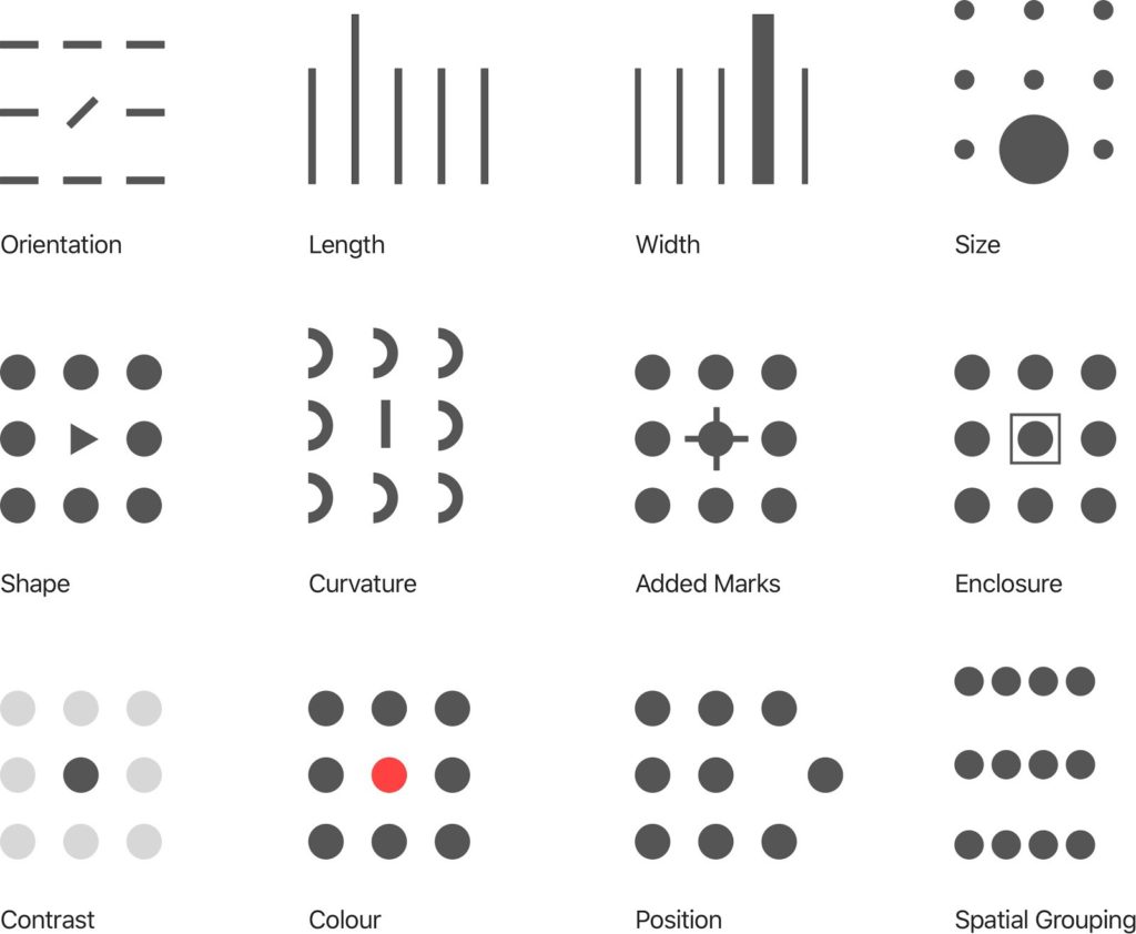
Perhaps you start with color. Say you’ve got a graph filled with lots of different colors. It looks pretty. But is it communicating clearly? Chances are, if you reduce some of the colors in your data visualization, you’ll be able to direct your audience’s attention more easily. In the example above, the designer has only used light gray, dark grey, and red. If you close your eyes and then open them and look at the example again, you’ll notice how your eye is immediately drawn to the red dot. That’s intentional.
You want the same intentionality working for you when you present data. In each set, it is instinctively and immediately clear where you should look first. Is the same true of the data you are showing in your slide decks? If not, how can you use the principles above to more clearly communicate with data?
Once you’ve conquered how to use color to direct your audience’s attention, see how the other preattentive attributes can become part of your communication toolbox, helping you to get your message across more quickly and more clearly.
Reduce Unnecessary Visual “Noise”
Finally, you should get rid of anything in your data visualizations that isn’t necessary. Knaflic calls this clutter, which she defines as “visual elements that take up space but don’t increase understanding.” She says, “When our visuals feel complicated, we run the risk of our audience deciding they don’t want to take the time to understand what we’re showing, at which point we’ve lost our ability to communicate with them.”
When you give a presentation that is wordy, the audience easily gets bored or confused. But when you edit those words down to more concise statements, what you say has greater impact. The same is true for visuals. But not many of us have learned how to edit our visuals. But the overall principle is the same whether you are working with words or pictures. What nonessential elements can I get rid of to make my communication more effective?
To see how Knaflic declutters a graph, check out her before and after example below.

The one on the left might look like graphs you’ve seen in presentations before. And it’s not that they don’t communicate at all. It’s just that they could communicate much more effectively. Like the graph on the right.
You can see how Knaflic has removed all unnecessary lines or labels (and there were a lot of them!) She has changed the graph from 3D to 2D. In addition, she has simplified the text to tell a much more direct story. But that’s not all. Check out her entire decluttering process for this graph on her blog.
We live in a multi-media world where data visualization is increasingly important. It has taken a forefront in recent years as we all seek to process huge amounts of data surrounding the COVID-19 pandemic and vaccination rates.
Presenters of today can’t just be good with words. We have to know how to use data to tell stories, too. That means understanding the persuasive nature of data storytelling. It also means being skilled and intentional with how we direct our audience’s attention using preattentive attributes. And finally, it means being able to reduce clutter in our visuals so that we don’t bog down our audience.
In the end, it just means understanding all of the ways we communicate in the modern world. It means being able to leverage data visualizations for our presentations in ways that resonate with our audiences.
At Ethos3, we believe powerful words and impactful graphics should come together to create compelling narratives. From our design team to our presentation coaches, we are ready to help you take your presentation to the next level.
