It’s high time we move past presentations with a bullet point list on every slide. These run-of-the-mill presentations just don’t cut it anymore in our fast-paced, multimedia world.
Today’s audiences are consumers and creators of beautiful design. We value aesthetics. So naturally, we form opinions based on the way things look. A Stanford University study showed that more than 46% of participants formed an opinion about whether or not a company is credible based on website design alone.
In our highly visual world, it’s pretty safe to assume that this statistic carries over to presentations. Which means, your audience is deciding whether or not you are credible based on the visuals you present. In other words, it’s time to lose the lists.
But we realize we can’t ask you to give up what is familiar and comfortable without alternatives. So here are two things you can use instead of a bulleted list in your next presentation.
1. Use Anticipation Space
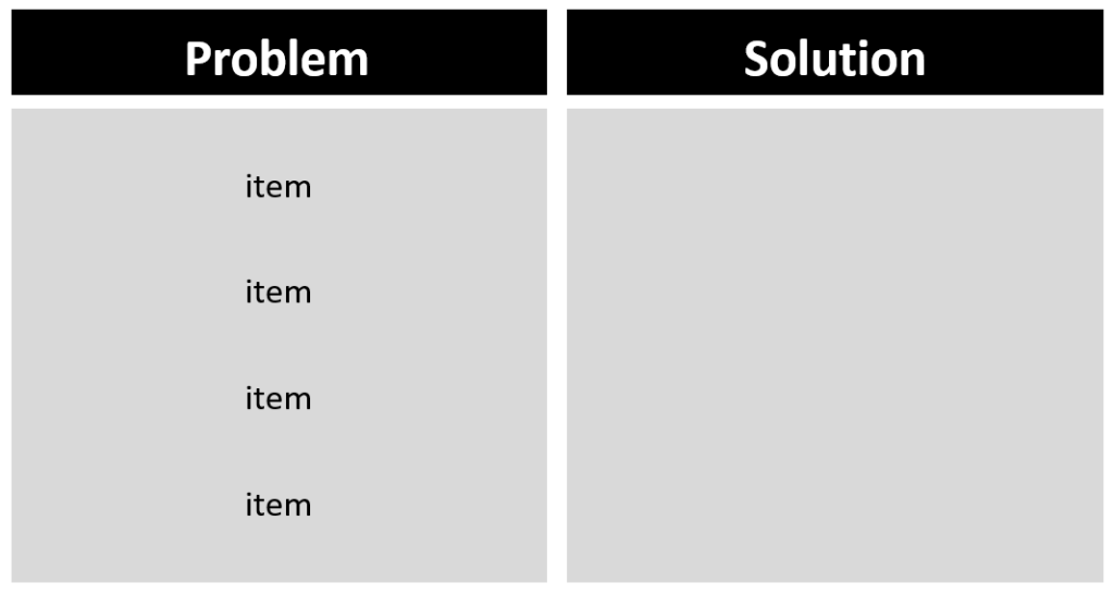
Bestselling author and presentation coach Jerry Weissman suggests using what he calls “anticipation space.” Instead of one bulleted list, divide information up in a way that keeps the audience guessing what is to come by creative use of blank space. This is a technique taken from the film industry. Weissman says, “Years of watching movies and television has conditioned us to recognize that when an empty space appears on the screen, that space will be filled.”


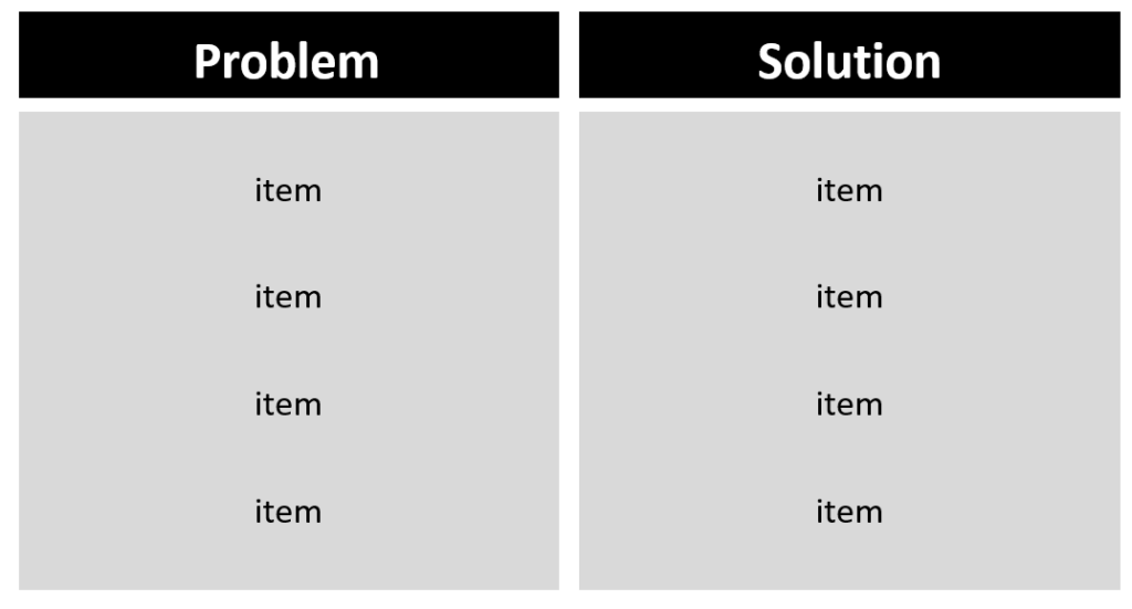
Instead of the overdone bulleted list, try dividing your information into visual categories. Divisions like problem/solution, present/future, or their product/our product can work well for anticipation space. This will not only help break up the bullet pattern, it will help the audience to see the relationships between the content.
2. Change Words to Graphics
Let’s jump back to Jerry Weissman again for a moment. He has another important concept that can help us avoid those bullet points. It about a disease that many speakers have become infected with, and it’s called “presentation-as-document syndrome.” For some reason, we’ve come to believe that our presentation media needs to function much like a report or a transcript of our speech. But that’s simply not true. The role of the presentation media like our slides, is to show, not to tell.
We all want to create slides that will be more appealing and will have a greater impact on our audiences, right? To accomplish this, we need to change words to graphics as often as we can. While text on a screen is visual (as in, we see the words), our brains process words, even words on a screen, much like auditory input. That’s even if the speaker doesn’t actually read the words to us. However, images on the screen, icons and pictures, are processed differently. And studies show that we can’t remember things we hear (words) as well as things we see (graphics). So when you are tempted to put words on the screen, ask yourself if the same thing can be communicated visually. It can be as simple as subbing out the words “saves time” for the image of a clock or an hourglass.
A presentation designed to appeal to your audience’s highly attuned and visually oriented brains will resonate more than just a list of words. Can we toot our own horn and show you an example of how that works? Check out this video we created about presentation design. Pay attention to how few words you encounter along the way.
Getting away from the bullet points can feel like setting off into uncharted territory at first. But it’s a journey all speakers need to take. What your audience sees on the screen influences how much they remember about your presentation. It also influences what they think about your credibility. So try using anticipation space or changing text to graphics the next time you speak.
If you just can’t seem to let go of the bulleted list, we can help you take those first steps toward better presentation design.