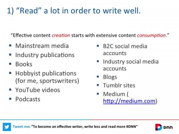
I can personally attest to the negative effects of bullet point lists, as well as numbered lists, in presentations. A few weeks after watching a presentation delivered by members of the TED staff, I can only remember the slides that utilized visuals, and avoided lists of text. The slides with information presented in a list were memorable only because I was shocked to see this ineffective design technique on TED presentation slides. The information shared in the lists was forgotten immediately after the list disappeared from the screen. However, I clearly remember the information that was delivered using visual slides, even weeks after the presentation.
 Is this a personal preference? No, it is not.
In 2014, the International Journal of Business Communication published the results from The Use of Visualization in the Communication of Business Strategies, an experiment conducted to gather empirical evidence regarding whether the use of visualization is better than text in the communication of a business strategy.
The results of that study confirmed that lists of text should be avoided for presentations designs. Visual slides are undeniably more effective for business presentations.
Specifically, the study concluded:
Subjects who were exposed to a graphic representation of the strategy paid significantly more attention to, agreed more with, and better recalled the strategy than did subjects who saw a (textually identical) bulleted list version.
In summary, bullet point lists kill presentations because your audience will struggle to pay attention to your lists, agree with your lists, and recall your lists. Those three reasons should be enough to convince you to never use bullet points again.
So, how can you avoid bullet points, and similar lists of text in your presentations?
1. Minimize the items on your list.
First, identify the most important items on your list. If you’re planning to present a “Top 100” list in your presentation, consider reducing the list to the “Top 3.”
Additional resource: The Rule of Three for Presentations
If you are convinced that your audience needs to know all “Top 100” items, plan to share the complete list with your audience via a handout that audience members can take with them. They will never remember all 100 items anyways, so providing this information in a handout will be useful for audience members. Also, by utilizing a handout, you can reduce your list for your presentation without sacrificing any of your data.
2. Create one slide for each item on your list.
Once you have reduced your list, design one slide for each item from your list. If an item is worth mentioning, it surely deserves its time in the spotlight, on its own slide. Remember to design highly-visual slides that have minimal text.
For example, we designed the popular 12-slide presentation below to feature only 10 facts. For bullet point enthusiasts, these 10 facts might have ended up on one slide, with a single list of text. Take a look at the example below to experience the power of delivering one fact per slide. Surely you will agree that this visual, extended approach to a list is superior to a bullet point list of text on a single slide.
3. If you cannot create one slide for each item, present a highly-visual list.
Sometimes you simply cannot follow the advice above. If you find yourself in a situation that limits your options for slide design, be innovative with the layout of your list. Never default to a bullet point or numbered list of text. Your list should still be creative and feature visuals that will resonate with your audience.
The slides below, from an Ethos3 “Slide Makeover,” demonstrate this presentation design technique:
This was the original, “pre-makeover” slide:
The two slides below were designed to elevate the presentation of the list shown above:


To learn more about this presentation makeover, read the full article on the Official SlideShare blog: Slide Makeovers: Transforming PowerPoint Bullets Into Visual Learning
View all of the “Before” and “After” slides here:
Conclusion: Lists of text can kill your presentation. Instead of bullet points and numbered lists, design your presentation so that only one idea is presented on each slide. If you must present a list in your presentation, be creative with your slide design, and display your list in an unexpected style.
