Did you know that looking at scenes of nature, whether in a photograph or right in front of you, can reduce stress and improve your mood? In 1979, behavioral scientist Roger S. Ulrich found that green spaces provided an antidepressant-type effect on adults.
“His psychological testing showed differences in mental states and outlooks after the students viewed various environmental scenes. The nature scenes increased positive feelings of affection, playfulness, friendliness and elation.” (Source article, Seeing Green: The Importance of Nature for Our Health)
By our math, if seeing a single image of nature can produce such impressive results, then an entire presentation of gorgeous natural imagery can turn a bad day around. We created a deck filled with facts about America’s national parks in order to feature some of the most beautiful nature photography available.
Check it out here, and then scroll down to learn how you can use these same techniques in your own presentation design:
Rule #1: Keep the slide clean
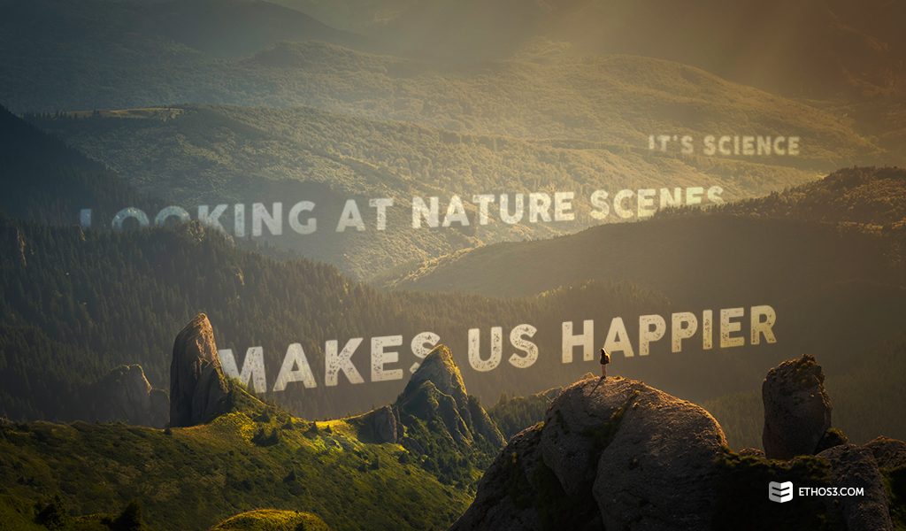
Why gild the lily? If you have a great image, avoid covering it up with too much text, overlay, or other design elements. In this example deck, the text additions are placed within open spaces in the frame. This means that the very best part of each photo is apparent, drawing the viewer’s eye and hopefully giving them that “aaah” feeling.
Rule #2: Minimize color additions
Colors in nature are rich and varied; they don’t need to be minimized or competed with. In our presentation, we chose a subtle white shade for the text overlay throughout. Take a queue from our design and limit your palette to 1-3 complementary shades that clearly show your text or elements without trying too hard to catch the eye.
Rule #3: Aim for consistency
Mountains, jungles, gardens, and lakes. There are so many biomes and nature scenes to choose from if you want to incorporate nature into your design. Our recommendation is that if you pick a specific nature scene, you should stay within that same “genre” of nature. Want to describe challenges your company has overcome? Use photos of rocky mountain cliffs. Want to describe bountiful growth? Use images of a garden growing from seedling to sunflower. Nature offers so many different themes to accommodate so many different types of visions; make sure you choose the best one for your message, and then keep it consistent.
You can’t lose with a library of beautiful nature photographs. It adds instant mood and design boosting capability, with the benefit of being inherently fun to look at. Marry your message with a visual nature theme and follow these handy rules, and the “wow” will follow.
Want to read more about using photography to enhance your design? Check out these related articles!
Stock Photography Advice For Presenters And Marketers
Picking the Right Photo For Your PowerPoint Template
Designing With Client Photography: Our Belmont University Showpiece