If you’ve ever watched your local channels, you’ve likely seen the main law guys in your area advertising their services. The commercials are all the same. The text is of a standard variety. And there’s too much of it on the screen. Each script spouts the same benefits; the same advantages. Visually, they look like they are straight from the 90s. It’s 2016 – almost 2017. How has the format and design of the law office commercial not changed by now?! This phenomenon is not isolated to these subcategories of advertisements. In fact, the investor presentation follows a similar pattern among various industries, companies, and brands. We think the investor presentation is long overdue for a trendy transformation. Here are 3 ways these decks can be overhauled:

1. Erase non-essential text
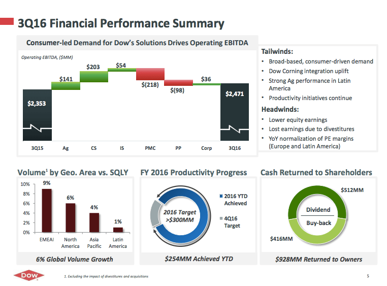
Too often, companies and organizations default to placing more elements on their slides rather than less. But, as the old saying goes, less is more. For example, take this Financial Performance Summary slide from the Dow Chemical Company’s 2016 Quarter 3 presentation:

When several charts, graphs, text, and imagery is included on an individual slide, it detracts from the impact of the message. This isn’t to say that the information on the slide above is unnecessary. Instead, what I am driving at, is that these concepts could be better displayed on 3 or 4 separate slides. As a general rule, we advocate representing 1 concept per slide.
2. Outline a clear narrative
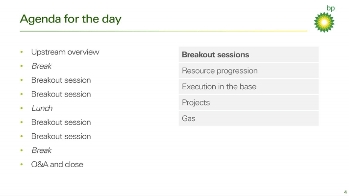
In addition to the common practice of adding an excessive amount of text, many decks struggle to define a distinct narrative. Let’s take a look at this agenda slide from a recent BP investor presentation:

Although we praise the inclusion of an agenda slide in every presentation at Ethos3, there is a more effective way to execute it than actual breakdown of activities as is presented above. Instead, narrow your presentation points to 3. Shorten the main ideas or concepts to digestible phrases or even a single word.
3. Add compelling visuals
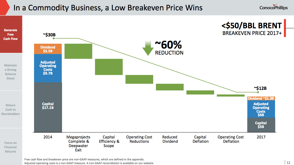
You know your audience. They’re investors. All they care about are the numbers. But that doesn’t mean that all you have to include on your slides are numbers. The slide below from a recent ConocoPhillips investor presentation is a perfect example of a slide that could benefit from visual simplification:

Sometimes a big, bold number can speak volumes over a complex chart or graph. Insert large, high-quality imagery, unique color-blocking, and essential text to convey each concept in your deck.
Step outside of the box with your investor presentations. Show your audience a more engaging method of information delivery and create a display that WOWs all who view it. For more presentation tips and tricks, review the resources listed below:
Choose the Most Effective Template for a Sales Presentation
Does My Company Need an Editable Presentation?
