There’s a lot to be said about the response billboards get when they convey clear messaging. After all, these ads are usually displayed on a highway while a driver is concurrently listening to music or a podcast, going 70+ mph, obeying posted signs, and following navigation instructions. With all the distractions in a driver’s world, billboards capture their attention, giving them something to think about. It’s a wild concept, but it works. Why? Because of design. We’ve realized that the design principles that work so well for billboards can be utilized in presentation design for visual messaging as well. Let’s take a look.
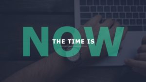
Big and Bold Concepts
The average person spends 5.4 hours a day on their phone. Therefore, as presenters, we are looking to capture an audience with very short attention spans. This is why billboard-level slides are effective. For the best level of engagement, think big and bold to grab the onlooker’s attention. Here are some ways we’ve done this recently:

Simplistic, Yet Communicative Language
It’s true: font size matters. In order to have a legible-sized font, it’s important to remember that simplicity is your friend. After all, content is best presented with ultimate clarity. As we know, content that overwhelms leads to disengagement. Once the language on a slide is pruned for maximum efficiency, the more “fun” elements of design can do the heavy lifting. Here are some slides where we condensed verbiage so the design could take the concept to the next level:
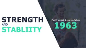
Captivating Image Selection
In advertising, a picture really is worth a thousand words. Images capture attention and are easier to focus on while driving than words. The use of an attractive and captivating photo related to your brand or messaging can draw the much-coveted attention of your target audience. For example, candid photography is relatable and will make your audience feel instantly connected to your imagery. Additionally, ensure your logo is highlighted properly throughout the deck. With the right use of logos, your viewers can connect the dots that YOU are the one who can provide this conveyed possibility or outcome.


Emotionally Targeted Response
Appealing to the emotions of your audience is powerful. Whether that be through humor, anger, empathy, or even sadness. If what you are aiming to communicate leans more on the lighthearted side, use a witty one-liner to make your audience laugh. If you’re trying to get a point across about an important topic, using a provocative photo as the backdrop can be really effective. Keep your demographic in mind when designing your billboard to better elicit a desirable response.


Take some time on your next road trip to observe which billboards draw your attention. Maybe think through your commute and try to recall which ads still stick with you to this day. These are hopefully the same goals you have for your deck. You want people to remember your message and pay attention. Well, we’re here to tell you we love a good success story. If you’d like to see where we fit into yours, let us know. Let’s get started making your deck billboard-worthy today!
