Before you open up PowerPoint or Canva or Prezi or Google Slides, we want you to think about something. How will you use text in your slide design? Presentation media programs are meant to offer visual support to your audience. They aid your audience’s understanding by supplementing what you say with what you show.
And yet, far too many speakers fill their slides with too much text. Today we are asking questions about how and when to use text in your presentation media with the goal of elevating our slide decks. We’ll look at three specific text considerations along the way. Do you need it? Where should you put it? And what should it look like?
Do you need it?
We put this question first because it’s the most important. When it comes to text on your slides, you should always ask yourself this question: do I really need this? Just because most PowerPoint templates are formatted with a text box for your title, doesn’t mean you need one. Consider your audience. What words will help them? We can do away with many titles and labels.
For example, take a look at the typical slide shown below. It has 39 textual elements (words or numbers) which the audience has to process.
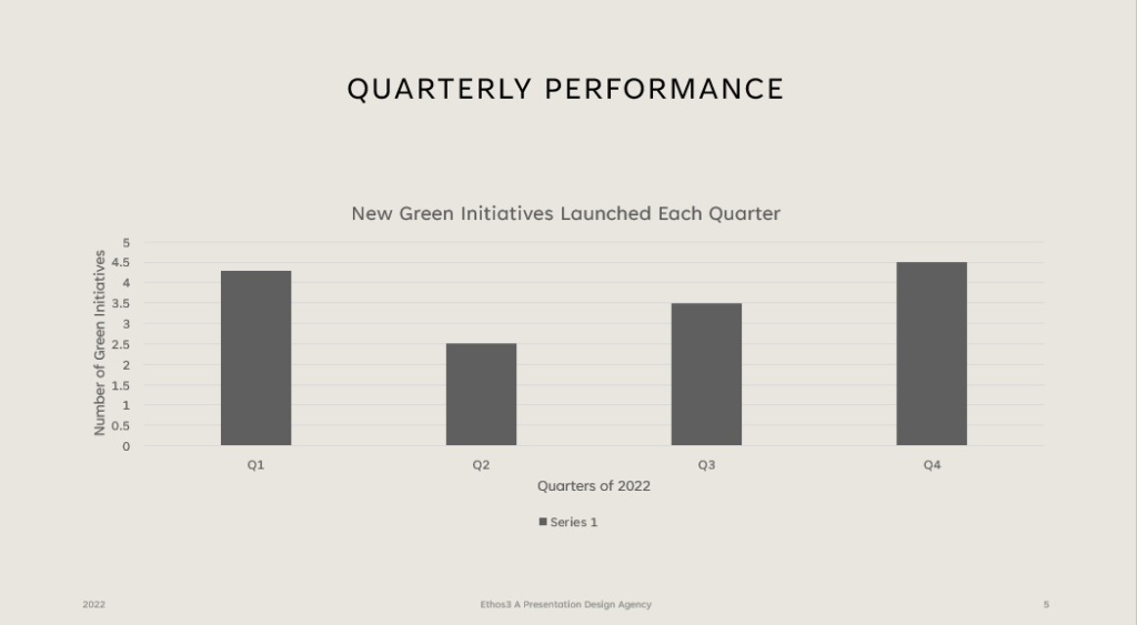 At first glance, it seems pretty clear, right?
But what if we start asking the question does this audience really need this to understand what I’m trying to communicate? You’ll be surprised how many times the answer is no. Once you edit out unnecessary textual elements, you might end up with something that looks more like this.
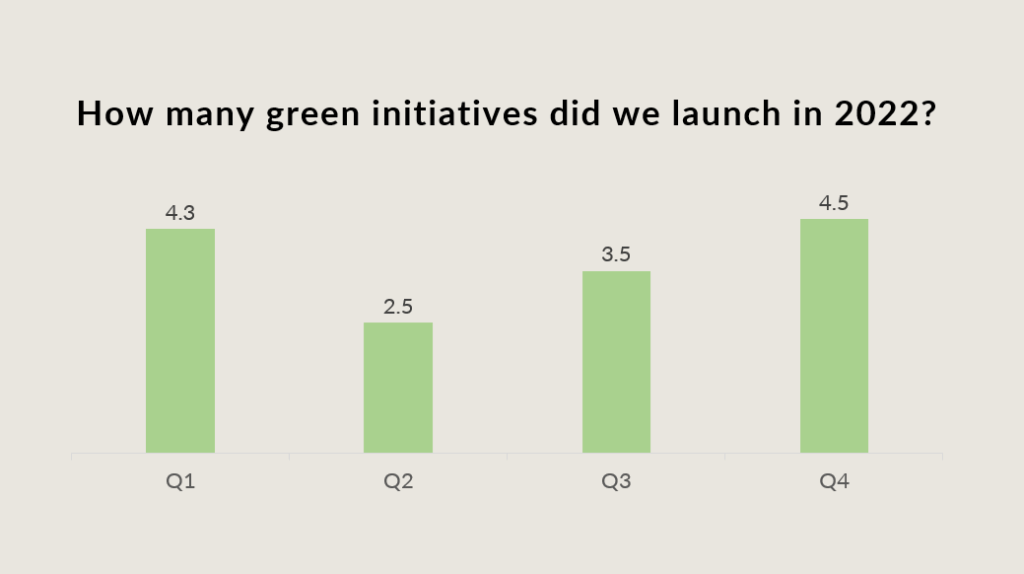 Here we have only 17 textual elements, each of which has a distinct job to do. By asking one simple question, we reduced the text on our slide by over 50%.
Where should you put it?
The second question to consider is how and where to place the text you decide to include. Designers often like to tilt text to make the slide design more interesting. And this can be good, but only to a degree. A quite literal degree.
Studies have shown that words titled 60% or less shouldn’t take your audience much longer to read. However, if you tilt a word more than that, it slows down their processing. Below is a slide with text rotated -60°and 60°. Does it take you longer to read?
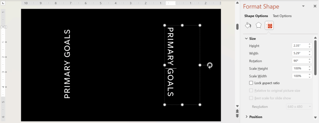
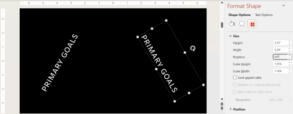 What about text that is rotated 90°?
 Another important question is where on the slide you should put your text. You might consider using the Gutenberg Diagram which shows that our eyes will normally travel the path they do when we read. We’ll start in the upper left-hand corner of the slide and move to the upper right-hand corner. Then we will glance down at the lower left-hand quadrant of the screen and move to the lower right-hand corner as shown below.
 What should it look like?
The final consideration is the style of your text. What font should you choose, and why? And how big should it be? Font choice is one of those things that can nearly immobilize you as you click through option after option after option. But we like to remind presenters and designers that font choice in presentation design comes down to 4 things.
- Does it match the mood and purpose you want your presentation to convey and achieve?
- Does it frustrate or slow down your audience members?
- Is it consistent throughout the presentation?
- And is it clear enough for everyone to read it on a variety of screen sizes?
To educate yourself on font choice, we suggest browsing through Butterick’s Practical Typography guide for lots of helpful and fascinating information. (For example, did you know that uppercase letters are called that because they used to be stored in the upper cases of print shops?)
When it comes to size, most experts say you shouldn’t use anything below 24 size font on your slides. Guy Kawasaki famously says 30 point is a better minimum.
We hope these 3 considerations will help you use text more thoughtfully and skillfully in your presentation design. Knowing how to edit out unnecessary text, place it carefully, and chose how it looks will help you created elevated slide decks like the pros.
For more ways to elevate your slide design, check out our blog now or get in touch with one of our experts.
