Contrast. It grabs and directs attention. It highlights what’s important. And it is, without a doubt, one of the most important things in your presentation design. So how do you make sure you have the right contrast ratio in your presentation design? You measure it.
Today we’ll share why contrast is important, and then we’ll show you how to use Adobe’s free contrast checker to make sure your slide deck passes the test when it comes to contrast.
Why is Contrast So Important in Slide Design?
Accessibility
The main reason we need contrast is so that people can easily view and understand the elements in our design. Without the appropriate amount of contrast, our eyes lose the distinction between colors and elements start to blur together. You can check out your own contrast sensitivity using the Pelli-Robson test here.
The Web Accessibility Initiative has published some standards when it comes to contrast ratios that can be seen by most people. While there are different levels (A, AA, AAA) for contrast, we’d suggest adopting the AA level minimum standards whenever you are designing. For successful contrast at this level, you’d need a contrast ratio of at least 4.5:1. There are a few exceptions: large-scale text and images of large-scale text can have less contrast (3:1) due to their size, and text that doesn’t offer any meaningful information is purely decorative or that is part of a logo doesn’t legally have to meet the 4.5:1 ratio either. But great designers aren’t clinging to minimums. They are figuring out how to use high levels of contrast to insure all their users can easily navigate their designs.
Aesthetic Attention
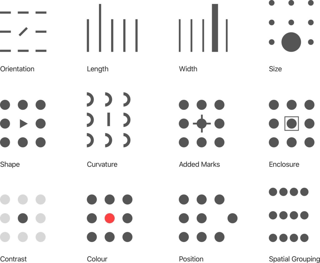
The other main reason for using high levels of contrast is that it grabs and directs audience attention. Designers make use of something called preattentive attributes all the time. Expert in data visualization Cole Nussbaumer Knaflic explains these well. She says that preattentive attributes are “elements like color, size, and position on page. [They] focus your audience’s attention on the most important parts of your data. These are visual cues that ease the processing of the information. When done well, there should be no question on the part of your audience when it comes to what is important or where they should focus their attention—it is obvious.” While contrast is not specifically named as a preattentive attribute, it is the foundational principle that underlies many of them as you can see below in this example from Callum Ballard of Towards Data Science.
Measure Contrast with the Adobe Contrast Checker
So how do you know if you’ve met the minimum contrast ratio of 4.5:1? Let’s look at an example. We recently wrote about Pantone’s 2023 Color of the Year, Viva Magenta (hex code #BB2649). If you missed that blog, you can check it out here. Proactive Creative says, “The complementary color for Viva Magenta is Mountain Meadow. This fresh green shade is also known as the opposite color as it’s directly across on the color wheel. So, these two colors have a strong contrast and are eye-catching when used together. The hex code for Mountain Meadow is #26BB98.” And sure enough, these colors look great together. But do they really offer enough contrast? Let’s use the Adobe Contrast Checker to make sure.
You can access Adobe’s Contrast Checker Tool here. Once on that screen, you can enter the hex code for your text color (Mountain Meadow) and your background color (Viva Magenta), as shown below.
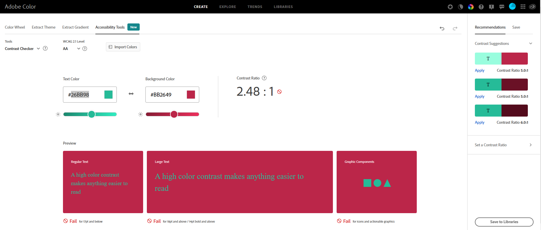 You can see that this color combination has a contrast ratio of 2.48:1, which doesn’t come close to our required minimum of 4.5:1. Adobe measures the contrast on 3 scales: regular text, large text, and graphic elements. And as you can see, this color combo fails on all 3 accounts. However, off to the right hand side of the screen, Adobe offers 3 different color combinations in the same family that have higher contrast. If I want to retain my original background color of Viva Magenta, I can click “apply” on the top suggested option and Adobe gives me a green color (hex code #99FDDE) that has a contrast ratio of 5.01:1 as shown below.
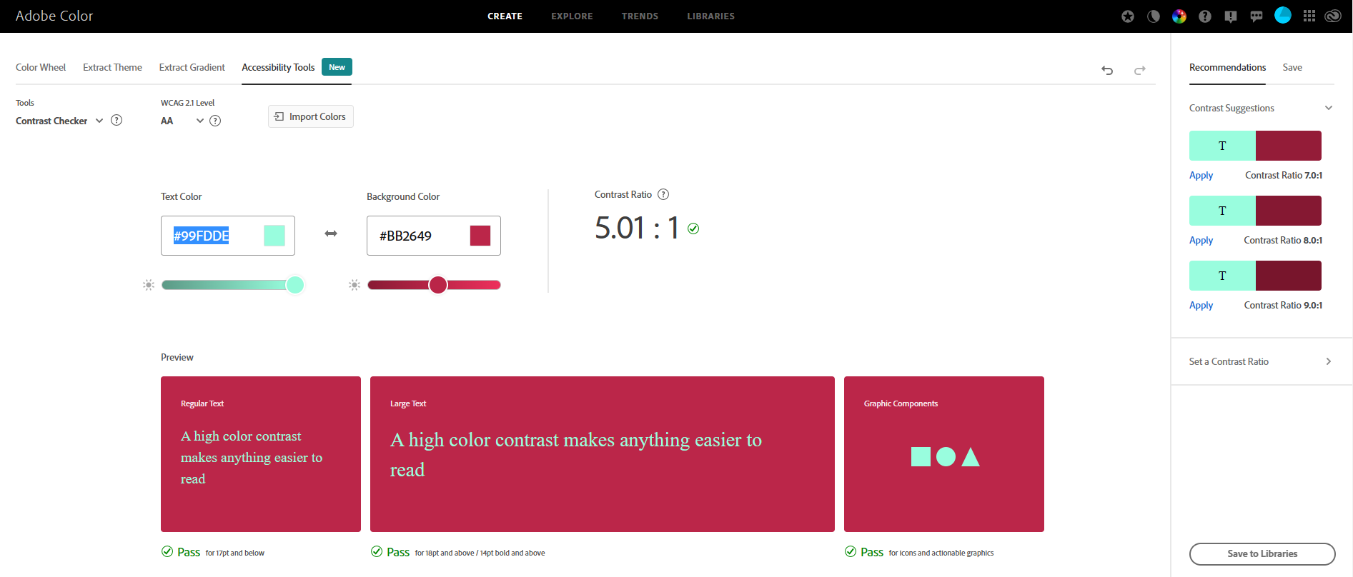 That’s much better. Contrast is important for making sure users can clearly read your text and understand your graphic elements. It also helps you gain and direct attention. Now that you know how to use Adobe’s Contrast Checker, you can measure your color ratio. Always check the colors in your presentation design to make sure they pass the contrast test.
For more ways to elevate your presentation, check out our blog or subscribe to our podcast. Or get in touch with us to find out how to collaborate with Ethos3 on your next big presentation.
