If you’re searching for design inspiration while staring at the blank slate of a presentation, fear not! There are tons of different techniques we’ve discovered which can improve the quality of your overall design and get your creative buzz going. Consider giving a few of these techniques a try, whether you’re working in Keynote, PowerPoint, other design software.
1. Boost Contrast – One way to make your message “pop” on the slide is to increase the contrast between the color of text and the background. Don’t let your text get lost in similar shades, like ill-placed subtitles in a movie. Instead, try making your text play the “opposite game” when it comes to other colors used on the slide.
2. Add a Bar – If you’re looking for a way to further highlight your text, a bar placed in front of the background or other images can hold your text so it doesn’t get lost. Consider making the bar stretch across the entire slide, or play with its opacity as this example shows.
3. Play With Opacity – Adding opacity or transparency to images, text, and objects can help you enrich a slide without making it too cluttered. It’s also a popular recent trend in design, showing up on high-end websites like these. Consider using a transparent bar to hold your text, or overlaying transparent shapes over your main images. You could even use opacity to soften an entire slide or scene.
4. Use a Blurred Image – While it sounds counter-intuitive, blurred images make excellent backgrounds for slides when you want to incorporate the colors within the photograph rather than the photograph itself. It also has the added benefit of making text more pronounced. Not sure what this looks like, or what kind of “blur” effect to use in your background? Here’s a handy guide.
5. Increase Image Size – A bold, full-image with minimal text can be incredibly effective in a presentation. It can break up the flow of text-based slides, and from a practical standpoint, people will be able to see it from the back of the room when you present. Consider using a high-resolution, full-screen image and start building your slide from there.
6. Change Text Alignments – Keeping text centered on every slide is a rookie mistake; there is a big world of slide space out there, so consider playing with placement and alignment. For example, align your text to the left of the screen of any image elements for a more balanced look. Check out this example to see what we mean.
7. Limit or Increase Your Palette – Too many colors in your design palette can make your presentation look like a carnival, but not in a good way. Likewise, too few colors can make your presentation flat and dull. Aim for 3-5 shades in your color palette, no more and no less. If you are looking for some palette inspiration, check out Adobe’s Kuler or COLOURLovers.
8. Change Up Your Font – Change your font selection to reflect simplicity and legibility rather than merely having a “fun font.” Start with fonts that are “Sans Serif” and test to see which looks most clear and readable on each slide. You may find that the professionalism of your deck gets +10 classy points with a simple alteration like font choice.
9. Creatively Crop Stock Photography – Feel like stock photographs are making your presentation design lifeless, generic, and a little spooky? Consider enlarging and cropping the image to focus on elements that don’t include cheesy smiles. You can emphasize hands in action or other natural elements of the picture rather than the image as a whole, thus sparing your deck from feeling unnatural.
10. Apply Image Continuity – Adding a visual theme throughout the presentation can help you select corresponding photographs and images. For example, if you are applying a “nature” theme to your presentation, be sure that the natural elements all look like they could be from the same location. A little continuity can go a long way to make your deck look professionally done.
11. Make Typography Part of the Scene – Have some fun with your text on-screen by moving it so it looks as if it’s a part of the background scene, like this example. You could also give your text a perspective effect, which is easy to accomplish and looks great, as seen here. Here is how to use the perspective effect, as taken from our article, “The Right Way to Incorporate Typography with Photography” on SlideShare:
“Once you’ve chosen your photo, just add your text, select it in the Layer Panel, right click the layer and convert the text to a Smart Object. With the Text Object selected, go to Edit > Transform > Perspective (or use shortcut command+T) then just grab a corner and drag it until the text is positioned in your desired perspective. It’s that simple.”
12. Play With Text Sizing – While you should always prioritize readability, add emphasis to important words or concepts by resizing individual words. Check out this example from one of our Valentine’s Day Decks, which contrasts with the same slide message that doesn’t play with sizing at all, as seen in this example.
13. Use White Space – A clean, white background with a single object in the foreground can enhance readability, create balance, move the audience’s eyes where you want them, and even add a dash of high class. Consciously decide to dedicate a slide (or even a presentation) to using this powerful technique.
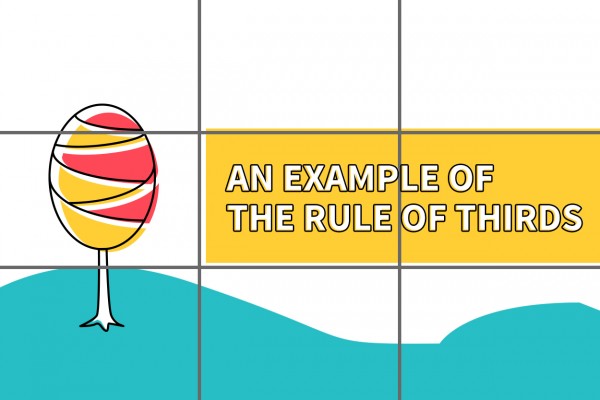
14. Break it Up Into Thirds – We love the Rule of Thirds for balancing the overall look of a slide. The way it works is simple. If you break up a slide into vertical and horizontal thirds, the intersections of those lines (AKA “the crosshairs”) are where you want to place the focal point of your slide. The use of empty space, as with the use of white-space, makes the object or information you are emphasizing stand out. Here is a great photographic example of what we mean.
15. Cool and Warm Colors – One creative way to contrast the background and foreground and help viewers focus on the right thing is to place cool colors (dark shades, blues, purples, etc.) in the back and emphasize your important foreground items in warm colors (reds, yellows, oranges, etc.). Becoming more familiar with color harmony can make you a better designer without having to learn any complicated Photoshop tricks.
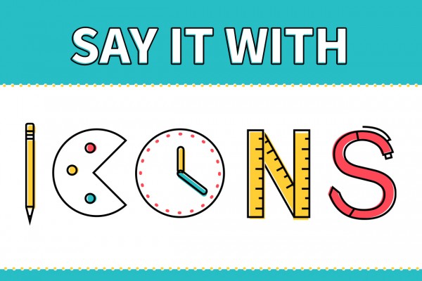
16. Say It With Icons – If you must use bullet points on a slide, consider replacing the generic dot with sized-down images which will serve as icons. These can add character and consistency with your overall visual theme. However, be sure that they still remain visible when resized and can still be seen by people in the back of the room.
17. Create A Textured Background – Make your own tasteful background by creating shapes and layering them with different colors, gradients, and patterns. Transparency is the key to turning a mess of a collage into something uniquely your own. Here’s a great video demonstration on how this effect can be achieved.
18. Test Out Different Balances – In the same way that the Rule of Thirds can apply weight to focal elements, you can shift the balance of objects in your slide until you feel that the important text or images are featured. Here is what a balanced slide looks like, and here is the same kind of slide with asymmetrical balance.
19. Add Movement – Curved lines that moves throughout your text, from image to image, and even slide to slide can help your audience visually move through your content. Adding a sense of motion throughout your deck can also add a sense of cohesiveness throughout the presentation.
If you’re still feeling stuck and uncertain which direction to take your design, take a step back by working on a moodboard until you find the visual inspiration you’ve been looking for. Branch out! Go bold! Try something new with your presentation design today.
Question: What design elements would work for your presentation?


