Wikipedia defines minimalism as a movement where “the work is set out to expose the essence or identity of a subject through eliminating all non-essential forms, features or concepts.” That same definition applies to an effective presentation. We want to expose our content as clearly and cleanly as possible for our audience, and the best way to do that is by getting rid of anything non-essential.
A significant amount of power can be harnessed by using a minimalist style in your presentation. The more you eliminate unnecessary clutter, the more accessible your information will be for the audience. Also, a minimalist style encourages you to speak to your slides, which always makes for a more compelling, engaging presentation.
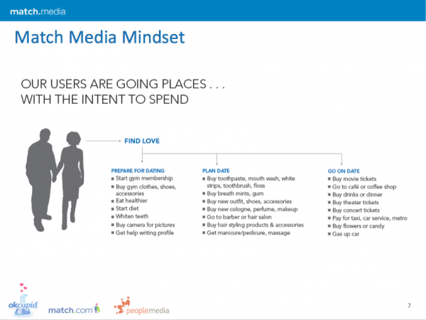
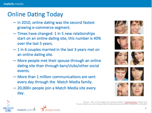
Below are examples of before and after slides from a presentation we worked on for Match Media Group. Notice how the before slide examples are nearly exploding with information with no emphasis to draw the audience’s eye to what’s most important. Contrast that with the after slide examples where there is a clean, minimalist design that focuses on one point.
BEFORE
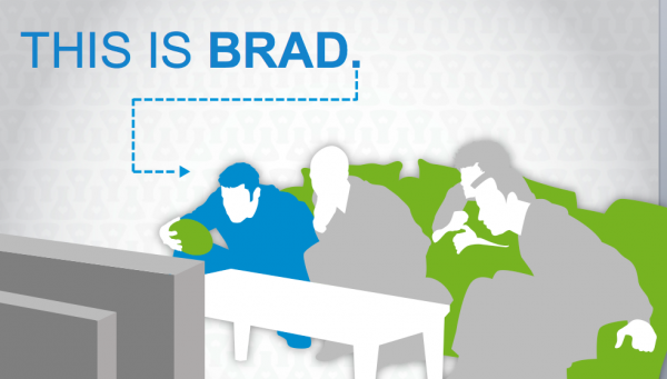
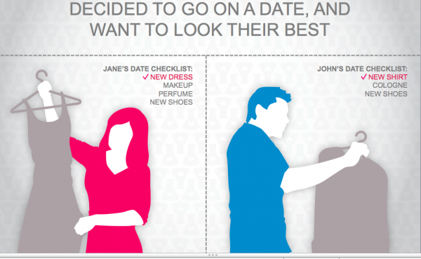
AFTER
Notice how different the before and after slides are here. The before slide tells the Match Media Mindset, while the after slides shows the Match Media Mindset by telling the story of Jane & John’s date. While the before slide includes a cumbersome list of elements of the dating process, the after slides allow the presenter to explain the process through storytelling, giving the story a more powerful and personal tone. Also notice how minimalistic the after slides are compared to the before slide. Break up your information onto multiple slides to make it more compelling and simplistic.
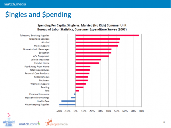
BEFORE
AFTER
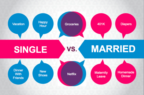
Notice how both the before & after slide examples display nearly the same information, but the way it’s presented in the after slide is much more compelling because of its minimalist design. It leaves a more powerful impression on the audience than the before slide because it makes the same point but with less information (the point here being that singles and marrieds spend money on different things). A minimalist design helps you say only what is truly necessary to get your point across.
BEFORE
AFTER
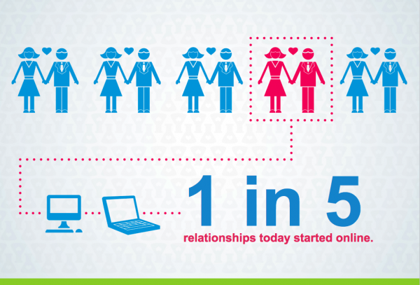
There is far too much information on that before slide, leaving the audience with no indication as to what is the most important takeaway. Look how much more powerful the after slide is; it’s sure to leave a lasting impression on the audience. Of course, it’s fine to include some of the other facts included on the before slide, but put them each on a separate slide. The minimalist design leaves a much more powerful and memorable impression on the audience. They know what to look at; they know what they should remember.
