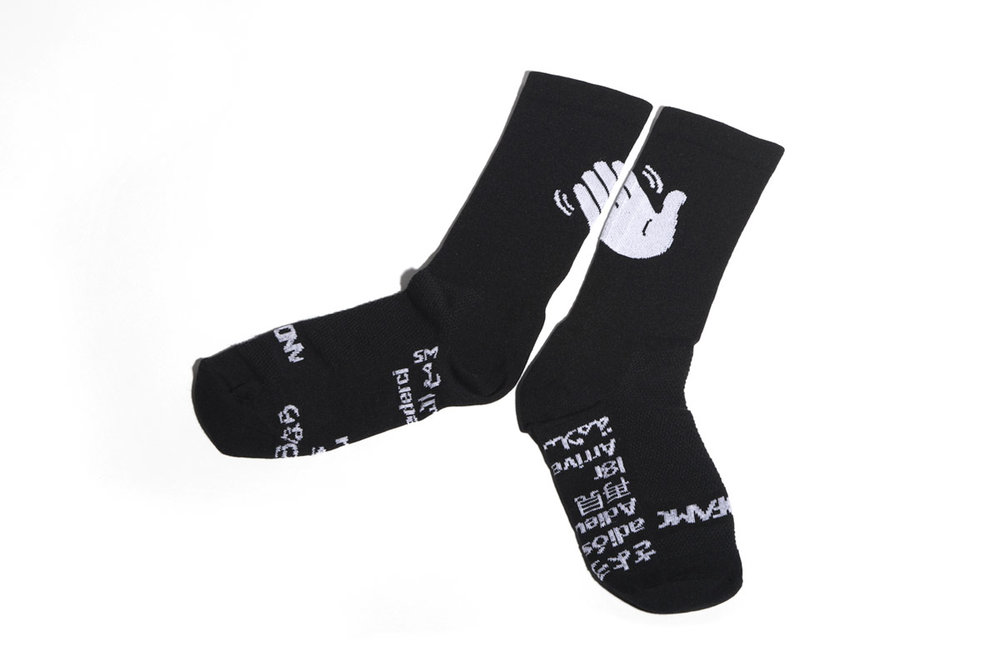
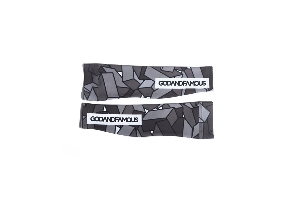
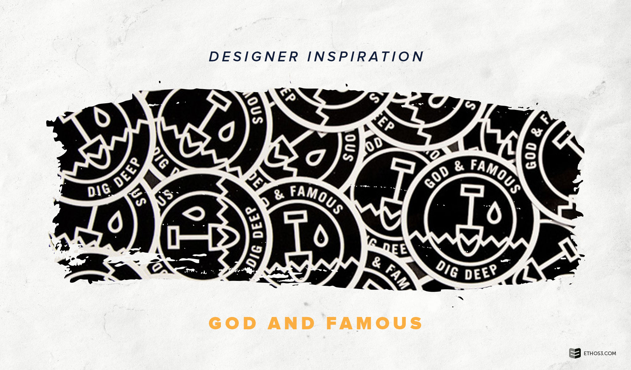
This week’s presentation design inspiration comes from cycling clothing company, God & Famous. The lesson? Establishing a recognizable and unique brand identity. The design of their materials – digital and tangible – reflects a consistent tone and attitude. From their blocky, black and white logo to their products of the same color scheme, God & Famous is a prime example of brand consistency.

Source: God & Famous

Source: God & Famous

Source: God & Famous
By creating different design layouts and textures through the application of black, white, and gray tones, God & Famous cultivates a cohesive brand. While the company’s range of color choices is limited, an expert use of patterns increases options.

For companies, organizations, and brands who feel constrained by their brand guidelines, God & Famous illustrates the potential even the most basic of color schemes can provide. Remember, too, that the familiarity of your brand look and feel is crucial for your efforts to increase brand awareness. In fact, an overwhelming majority of marketers trust branded content over advertising (72%) and direct mail and PR (69%). So staying within a certain set of boundaries works in your business’ favor. In addition, the God & Famous brand demonstrates the value of visual cohesiveness. Not only does it manufacture an intriguing design, but it also helps the brand achieve a clear tone.
Creating a Cohesive Presentation Design
What makes the God & Famous brand so successful? The designers integrate a simple color palette with visual repetition – completely embracing the “less is more” philosophy. When you view the company’s products and scan their website, you immediately notice the hardcore, trendy demeanor of the brand from the black and white design. Repetition of visual elements like graphics and icons reveal the brand’s urban sophistication.
In your presentations, evaluate areas where you could implement visual repetition and take full advantage of a color scheme you might think is restrictive. Ask yourself the following questions:
Could I utilize our logo in a creative way on header slides throughout my presentation?
Am I currently using shapes consistently in illustrations, graphics, and iconography?
Have I analyzed ways to invert colors within a slide’s design?
Am I using our brand colors as image overlays to produce visual texture?
Crafting responses to these questions will allow you to start a foundation for your cohesive presentation design.
Want to discover more presentation design inspiration? Check out some of our favorite designers and resources:
Presentation Design Inspiration: Jessica Hische
Presentation Design Inspiration: Team Dream
