For a presentation to be effective, all of the various presentation elements must align, including the content tone, content theme, narrative structure, and the presentation design.
If these elements are not in sync, the presentation will feel disjointed, and the audience will receive mixed signals about the overall message of the presentation.
Professional Presentation Design Example
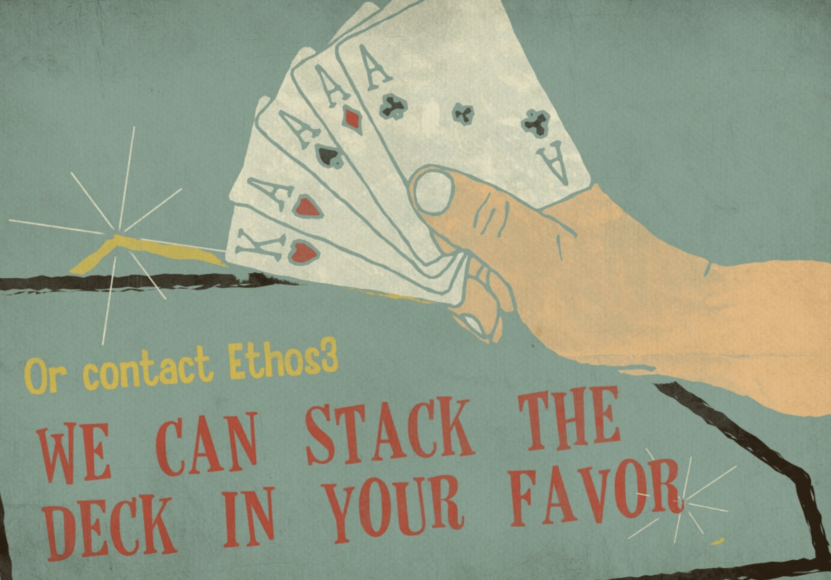
To demonstrate the power of a presentation designed to align with the topic, tone, and narrative of the presentation content, here is a presentation designed by the presentation design professionals at Ethos3.
Here is how the Ethos3 presentation design team approached the design for this deck:
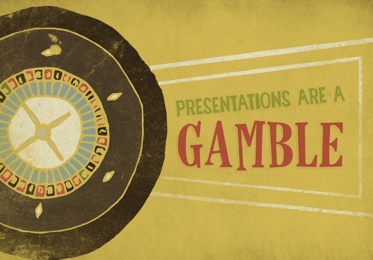
The 50’s mod design style was selected to complement the theme of presentations are a gamble. The vintage, distressed print style is used throughout the deck to enhance the theme of old/vintage Las Vegas.
If your presentation would benefit from a throwback style with a personal feel, the hand-drawn illustration style used for these slides would be a great fit for your deck.
This presentation design style works well for both online and offline presentations. Due to the number of colors used (both in the illustrations and the textures), the load time for this design style will be slightly longer than a simple, flat design, however, it will not be a huge difference, so don’t let that deter you if you think this is the best style for your presentation. In addition, this design aesthetic would also work well on a iPad due to the faux print design style and the iPad’s retina display.
The process of creating this presentation involved drawing the illustrations by hand, and then scanning the illustrations. The illustration scans were then imported into Adobe Illustrator, turned into vectors, and enhanced with colors. After the illustrations were finalized in Adobe Illustrator, they were imported into Photoshop where the final touches of textures and typography were added.
The many steps, and technical skills required to complete this presentation design were a worthwhile investment. The completed deck communicates a unified tone and message that is easy for the audience to understand and enjoy.
Conclusion
Carefully select a presentation design style that will enhance your content, and add depth to your message and theme. Consider your audience, delivery method, tone, and especially theme and narrative when choosing a design style for your presentations. Surprise your audience with a presentation design style that goes above and beyond the average slide deck. If you do, you will be rewarded with a big win.
Additional Resources:
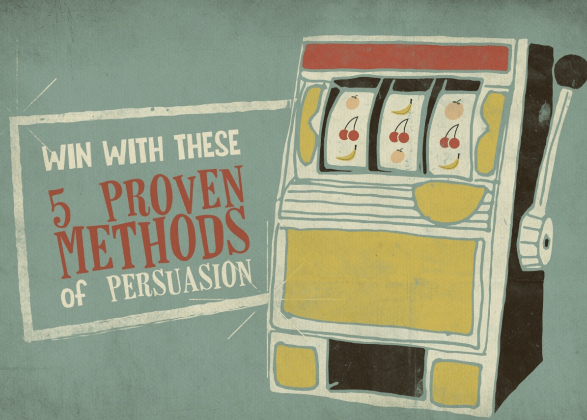
The Ace Up Your Sleeve: 6 Proven Methods of Persuasion
The Best Way To Communicate Your Ideas
Why Passion Is Essential For Success As A Public Speaker

