Taylor Swift may have famously called it “Blank Space”, but that phrasing seems to imply that something is missing. We think “white space” is more accurate as a term when it comes to the absence of text, image or other design elements in a given art form. For extremely scientific reasons, opting for a splash of negative, or white, space tends to lend a more cogent and creative feel to any kind of art; presentations are no exception. To the contrary, they may be the best use case of this technique.
Take, for instance, this before and after:
Before

After

Or this one:
Before

After

Both “after” slides are real slides from actual Ethos3-created presentations, by the way. You can see more Before & After examples here.
The difference that a small shift in position can make is rather radical (having a world-class design team helps, of course), and notably, there’s no loss of information. If anything, it’s actually much easier to absorb the information on the slides without the distraction of inefficient design.
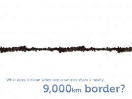
In the first example, from PhoCusWright, the concept of the slide practically begs to be transformed into a simple visual, but it is nevertheless expertly executed. While branding is important, in this case, the top and bottom of the original slide is too busy and, again, distracts from the central idea of the presentation.
In the reworked version, however, the text is practically unnecessary, the image and negative space do such an efficient job of communicating the message. The white space in this case is also literally white, providing a wonderful contrast to the most important feature on the slide, the border itself.
In the second slide pair, from a project created for ESPN, the white space trick is actually pulled off by removing white from the image altogether. This may seem counterintuitive, but keep in mind that white space is another term for negative space, and then revisit the comparison.
By pulling the main points of interaction out of the center of the image, and moving them into the corner, the designer was able to create more interest in what is basically the same amount of space, while enhancing readability. How? The Rule of Thirds. Essentially, The Rule of Thirds is a design maxim that is born from the idea that content which exists outside of the traditional center frame in an image is by default more interesting and absorbable. As Digital Photo Secrets explains,
“One way to explain why it works is to think of it like this: if your subject is in the middle of the image, it’s considered static. Your eye is drawn to it then has nowhere to go from there because the object is equal distance from all sides. Therefore when your subject is positioned closer to one of the edges, it forces your eye to follow it…to find it. This allows the viewer to linger on your image longer. It makes for a more captivating photo because it’s almost interactive. Like a conversation going on between the photo and you.”
Actually, that makes a lot of sense, doesn’t it? The concepts of white space and The Rule of Thirds, as confusing as they may sound, are actually rather easy to understand, and even easier to implement. So while they may not truly be miracles, don’t be surprised if your next Ethos3 presentation ends with more than a few conversions.
For more on using white space in presentation design, check out this podcast from Ethos3 CEO Scott Schwertly.
