When designing a slide, negative space is one of those elements that are critical to consider. But what is negative space, and how does it impact a slide? Understanding how the elements of spatial awareness impact user experience can be challenging. Ultimately, the trick is to naturally draw the eye toward an element of choice.
There are three important factors to keep in mind when designing:
1- Teach your eye to see the negative space just as much as the subject matter.
Let’s first define negative space as “the space around and between the subject(s) of an image.” This is also often referred to as “breathing room”. Take a look at the image below, noting what your eye is drawn to first.

Probably quite undisputedly, the most prominent element of this photo is the dog.
So, what if the dog was not centered in the picture, rather off to the side?

Now, the negative space is overpowering the subject matter. Our eyes still focus on the dog, but it’s much harder to ignore the void on the left. That is due to a lack of balance–our brains automatically will try to fill this in. Let’s break this down even further in our next step.
2- Turn the negative space into margins when laying out your composition.
In this first photo, the dog is right in the middle of the composition:
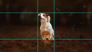
The margin above the head is equal to the margin below the paws, the left margin equals the right margin. Our brain doesn’t have to work hard to decipher what it is seeing because there’s balance surrounding the subject matter. However, while this photo of the dog is indeed balanced, adding content to this image could easily produce an imbalanced image.
This second photo tells a very different tale:
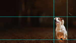
Here, all margins are different, which creates an imbalance from the start. However, this imbalance leaves plenty of breathing room for content. In doing so, we’ll have more margins to work from–our next step will be pairing them.
3- Try grouping margins when possible, aiming for the least amount of different margins as you can.
Let’s use the preexisting margin to the right of the dog to determine the margins of the text box:

Highlighted in teal, the right margin is equal to the green margins used around the text. Seeing these margins, i.e. seeing the negative space within your slides, helps with organizing your information.
Here is your balanced slide:

By grouping margins, we make it as easy as possible for the audience to decipher where their eyes should land. A good rule of thumb is to repeat a margin as much as you can, like we did for the dog. Finding the “right one,” though, just takes some practice. It also depends on the size of the other puzzle pieces.
For instance, here’s an alternative we made using the margin size below the dog:

We originally chose not to use the bottom margin because the amount of text allowed itself more breathing room than what the bottom margin dictates.
But, if we increased the amount of text the bottom margin would work just as well:

This takes time and practice to master. We encourage you to try a few different images, cropping to establish negative space, and then playing around with margins. Also, note how your favorite designers are using negative space, and see if they have implemented this design strategy. As Timothy Samara says, “Negative space is magical. Create it, don’t just fill it up!” If you need help creating negative space or filling it up, let our design experts know! We can get you a free quote today!
