You’re creating a pitch deck and you need to include data on your startup company. But how do you get from an Excel sheet full of numbers to something your audience will understand? You need help with data visualization skills (data viz, for short)—the art of making data understandable and attractive.
This skill is increasingly sought after by employers. Check out this list from Forrester Consulting that shows what US hiring managers/recruiters are looking for as of 2021.
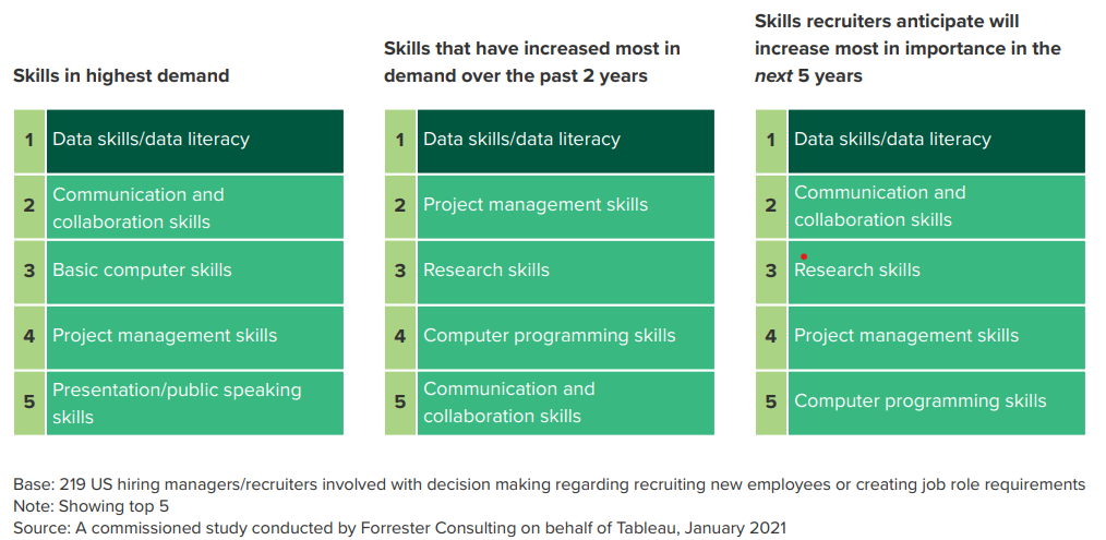
Image: Forrester Consulting
Data visualization skills tops the list in every category. In our last post, we looked at 10 of the best data visualizations throughout history according to Tableau. Today, we want to offer 3 simple ways you can build your data viz skills.
1. Read Storytelling With Data
Before you jump into any complicated programs or online courses, you need to understand the foundational principles of data visualization. The best source I’ve found for this is Cole Nussbaumer Knaflic’s Storytelling With Data: A Data Visualization Guide for Business Professionals. For just about $30, you can learn the fundamentals that will take your data along with all of your slide deck graphics to the next level. I study and teach presentations all the time, but this is one of those texts that is always on my desk. It rarely makes it back onto my bookshelf before I’m pulling it back out again for reference.
To check out some of what you’ll learn in this valuable text, check out Medium’s 6 important lessons from Knaflic’s book. You’ll find out why you should rarely (if ever) use pie charts and 3D effects.
2. Explore Data Viz Tools In Your Presentation Design Program
The presentation design program you are using probably has some data viz tools already built in. For example, on PowerPoint you can head over to your Insert menu. The Smart Art function generally offers text-based graphics whereas the Chart function offers number-based graphics. You can import data directly from Excel into PowerPoint using this quick and easy-to-follow video. Or you can build a data visualization from scratch. While these tools can get you started, it’s helpful to remember that they are only customizable up to a point. For truly unique graphics, you’ll need to seek out programs built specifically for data visualization, like the ones mentioned below.
3. Take an Online Course
After you’ve read about the fundamentals and played around with the available tools in your presentation program, it’s time to take your data visualization skills to the next level: online training. I know this can seem like a big leap to take, but keep in mind that chart at the beginning of this blog. When you learn data viz skills, you are meeting a marketplace demand which can translate to better job opportunities or increased pay. So let’s look at a couple of good online courses.
I’ll admit that I’m partial to Tableau, because I’ve been through their training myself. I’ve never been particularly gifted when it comes to numbers. So trust me, if I can do it, anyone can. Tableau’s own site boasts, “Tableau helps people see and understand data. Our visual analytics platform is transforming the way people use data to solve problems.” Their self-guided learning system is supported by helpful videos. I’d suggest looking into the Tableau Creator license, which runs about $70/month for individuals (they have team pricing available and other levels available, though). This license is “is designed for users who create content. This can include the design, cleaning, and curation of data sources, which others will use to analyze governed data, or the creation of visualizations and dashboards with which other users will interact.” It also includes a cloud or server-based subscription.
For about half the price of a Tableau Creator license, you can get a yearly subscription to FusionCharts. This tool offers over “100 interactive charts and over 2,000 data-driven maps.” This is a good compromise between PowerPoint and Tableau. You’ll have more professional looking data visualizations to pull from than you would in PowerPoint without having to create a viz from scratch like you might in Tableau.
One Last Idea
If you don’t have time to read a full textbook or explore existing data viz tools within PowerPoint, or if you don’t want to purchase yearly subscription, you do have another option. You can collaborate with a presentation design agency like Ethos3 on a case-by-case basis. Our experts don’t just know how to create beautiful data visualizations, they know how to couch them within the powerful narrative of a slide deck to make the most of your data for your big presentation.
