Presentation design can’t go very far without great data visualization. Data viz (for short) is data presented in an easy-to-understand, attractive, and narrative manner. It’s about as far away from an Excel spreadsheet as you can get in terms of looks.
Tableau is one of the leaders for data visualization. And I’ve been perusing their list of the 10 best data visualizations throughout history. When we look at these stand-out examples, we can figure out how to include better data visualizations in our own presentations. So let’s see what we can learn from these amazing visuals about telling the story, what to identify, and how to capture attention.
Tell The Story
Data viz skills are important because they help us tell better stories. Two of the main components of narrative are time and place. All but one these top 10 visualizations contain either story or place. Hanah Anderson and Matt Daniels’s “Disney Screenplay Dialogue, Broken-down by Gender” (#8 on Tableau’s list) doesn’t really involve a time or a place, but it still tells a clear story. All other 9 situate data in a story that tells when something happened or where it happened.
John Snow’s cholera outbreak map (#2) makes particularly strong use of place. It shows how cholera spread in a London neighborhood and helps us make sense of the movement of the disease.
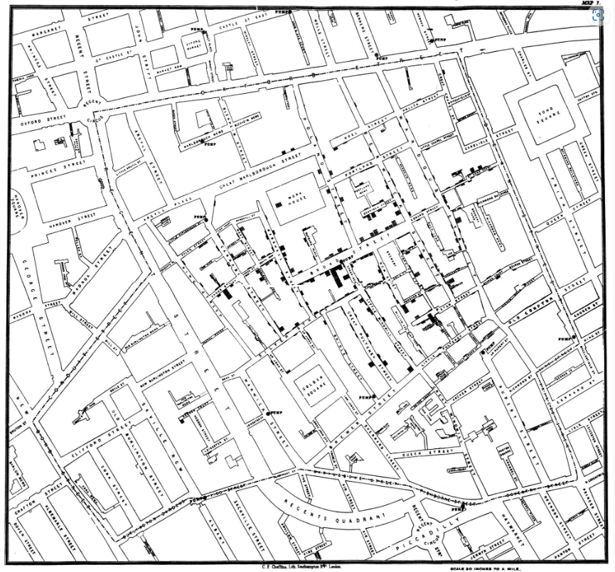
Image: Wikipedia
With this space-based data viz, it is instantly clear how location was tied to the number and locale of deaths. Chances are, you’ll need to incorporate one or both of these important narrative elements, time and place, into your data viz.
Identify Trends, Patterns, Groups, Outliers
If you were to look at data on a Microsoft Excel sheet, you wouldn’t initially be able to discern any meaningful patterns. This is another primary objective of great data viz, to clearly identify trends, patterns, groups, and outliers. It seeks to answer the question, so what? We’ve got all these numbers, all this data, but what does it mean?
Check out Hanah Anderson and Matt Daniels’s “Disney Screenplay Dialogue, Broken-down by Gender” (#8).
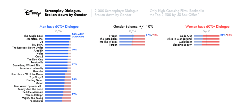
Image: The Pudding
This data visualization clearly identifies the 4 Disney movies that break the overwhelming trend of male-dominated dialogue: Inside Out, Alice in Wonderland, Maleficent, and Sleeping Beauty. I want to point your attention to something significant here. Anderson and Daniels could have chosen to show the male/female dialogue percentages all on one chart. It still would have been clear. But they separated the data into 3 related charts: male dialogue dominated movies, gender balanced movies, and female dialogue dominated movies. This makes their findings even more clear. You don’t have to wade through all 30 movie percentages to instantly see the 4 that stood out because Anderson and Daniels have already separated those outliers for us visually.
Capture Attention
As you move throughout the examples, you can see how developments in technology changed to help us capture attention.
Color
For example, the first major change is the introduction of color in Florence Nightingale’s visualization of “causes of morality in the Crimean War” (#3). After that, we see an explosion of color usage in data viz. But just because you can use a lot of color, doesn’t mean you always should. Look, for example, at the use of color in Density Design Lab’s “Languages of the World” (#6).
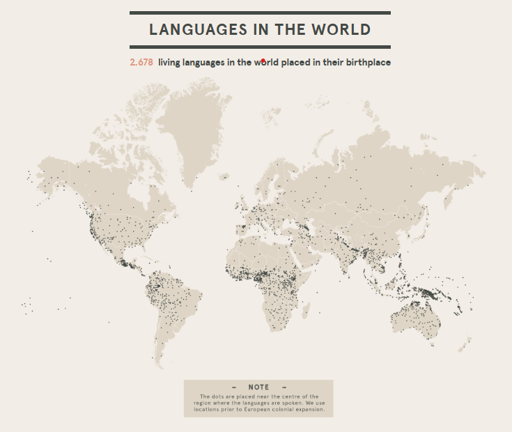
Image: After Babylon
The only thing in a standout color is the total number of languages, 2,678, which they’ve highlighted in red. So color is definitely something that you’ll want to use thoughtfully to direct attention in your data viz.
Movement
As technology progressed, the world of data visualization began to incorporate movement. Check out Pew Research’s “Percent of U.S. Population by Age Group” chart (#7). Notice how the movement becomes part of the story, clearing showing the trend of people living longer continuing into 2060. The Washington Post’s “Every Upcoming Solar Eclipse (until 2080)” (#10) also uses movement. This data viz is truly interactive. Tableau says, “If you put in your year of birth on the page, it will also tell you how many eclipse are left in your lifetime.” But just like we saw in the examples using color, just because new technologies are available to use doesn’t mean you always need to use them. Hanah Anderson and Matt Daniels’s “Disney Screenplay Dialogue, Broken-down by Gender” (#8) doesn’t need any movement to be clear and compelling.
Data visualization skills are increasingly important as we seek to share information in ways that are at once easier to understand and attractive to look at, especially in our presentation design. In our next blog, we’ll be sharing some ways that you can improve your own data viz skills.
In the meantime, check out our blog for more ways to improve your presentation design. Or get in touch with one of our experts to find out more about collaborating with Ethos3 on your next big presentation.
