Presentation design is a creative process. Your slide deck is a gallery of your artwork. We aren’t here to hamper your creativity or take over your gallery. But we’ve been in the business of presentations for over 16 years. During that time, we’ve studied which presentations make the biggest impact. We’ve learned what works and what doesn’t work. And we want to share that knowledge and experience with you by offering a presentation design checklist of 5 things that really, really matter: cohesive style, varied layout, attractive visuals, minimal text, and brand and audience specificity.
☑ Cohesive Style
Let’s go back to the gallery metaphor here. An artist should have a signature style. Think of Monet’s soft impressionism versus Dali’s melting clocks versus Bansky’s graphic activism. It’s hard to imagine an art show in which all of these varied styles would flow smoothly together. And yet, too many presentation designers treat each separate slide as its own piece. Rather, a slide deck should function as a cohesive whole. It should have repeated shapes, colors, patterns, textures, and fonts.
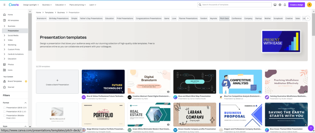
If you aren’t sure where to begin, you can work off of a professionally designed template. Canva, for example, has a library of over 13 thousand templates. And you can search for a specific type of presentation, or use the tabs (such as simple, education, pitch deck, or conference) to narrow down your search.
☑ Varied Layout
Great slide decks don’t repeat the same layout on every slide. You might be thinking, wait a minute, you just told me that all of my slides need to be cohesive and have repeated elements, now you are telling me to make them look different? Yes and no. While you do want to repeat elements, you don’t necessarily want multiple repetitions of the same layout. For example, when creating a new slide in PowerPoint, you’ll get a title box and a content box. We want you to break out of these preset frames.
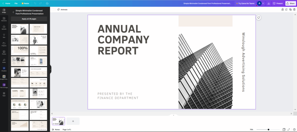
From slide to slide, switch up where you place your elements. For example, check out all the slide layouts on the left hand menu of this template from Canva. It looks cohesive but not repetitive.
 So move things around on your slide. And don’t worry that this will get confusing for your audience because it disrupts our typical top/down, left/right eye pattern that we follow when we read. New studies have proven that our eyes are naturally drawn to meaning. So you can place meaningful elements in various positions on your slides. We’ll still find them.
☑ Attractive Visuals
With the explosion of available stock images and graphics, second-rate visuals won’t cut it any longer. One of the fastest ways to elevate your presentation design is to use more attractive visuals. Any images or graphics you include in your presentation need to be clear, high in contrast, and purposeful. Check out our blog on the pros of using stock elements for a list of some really great ones to check out. Or if you don’t want to pull from a stock element bank, you can create unique and beautiful images using an AI generator. Find out how to incorporate AI into your presentation design.
☑ Minimal Text
Presentation expert Jerry Weissman famously said that the presenter should tell and the slides should show. When you include too many words on your slides, both the presenter and the slide deck are telling. One of our favorite text minimalists is Bill Gates. If you watch his presentations, you will see simple slides with very few words. So be like Bill; edit out the words you don’t absolutely need in your deck.
☑ Brand and Audience Specificity
The last thing to keep in mind is that you aren’t creating a slide deck in a vacuum. Your presentation design is going to communicate something to someone (your intended target audience), for someone (your company, product, client, etc.). These are important factors in your design choices. Check out our blog on why audience analysis is so crucial for a list of questions that will help you tailor your presentation to your specific audience.
But the audience isn’t the entity to consider. Great slide decks are extensions of the people they represent. That means Monet’s PowerPoint presentation should clearly represent Monet’s brand. When you use brand shapes, fonts, and colors, you extend the reach of your brand. And your presentation becomes part of your larger company narrative rather than a one-off, random slide deck.
That’s it:
☑ Cohesive Style
☑ Varied Layout
☑ Attractive Visuals
☑ Minimal Text
☑ Brand and Audience Specificity
You can use our presentation design checklist to guide you as you develop incredible new slide decks. Or, you can apply it to presentations you’ve designed in the past, updating and elevating them to make them more impactful. You might even create a Post-It note or digital sticky note to keep within eyesight while you are creating your next masterpiece.
Aside from offering simple tools like a presentation design checklist on our blog, Ethos3 has a whole range of presentation services available. Contact us now to learn more.
