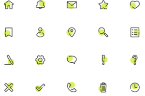
Icons are small, graphic elements. They appear on company branding materials, business cards, social media, or websites. They help direct customer attention and interaction. Our communication these days is so inundated with icons that they often fly under the radar, undetected. But take just a minute to see if you know what these mean.![]()
Pretty simple, right? Location. Email. Wi-Fi.
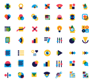
Changing the icons you use in your presentations and marketing materials is one of the easiest ways to update the look of your brand. So with help from our creative director, Kyle Scudder, we are covering 5 icon styles that will level up your presentations, keeping them fresh and current.
1. Uber-minimalism
Minimalism has been a trend in home design and logo design for some time now. So it’s no wonder we are seeing a return to simplicity in icon design, as well. Many Pixels says, “Reducing the design to its essentials allows designers to create straightforward, memorable illustrations without relying too much on the color palette or the shape. Simple icons are easy to understand, even though their representation isn’t always literal, which gives designers the freedom to be creative.” Because icons are part of our human language now, we don’t need much to understand them. So a less-is-more strategy keeps the “noise” of the design to a minimum, allowing the audience to focus on other elements.
2. Abstract
Abstract icons work well if you want to make your branding materials look a little bit different from everything else out there. You can skew the line between literal and physical representation and rely more on imagination or context clues. Design Shack says, “The nice thing about this style – and trend in general – is that abstract styles create a sense of whimsy and wonder that matches some of the bigger overall trends in design.” If you choose to use this trending style, make sure the icons you create are actually abstract and aren’t simply a close repetition.
3. 3D/Color Gradients

Many icon designers are using 3D design as well as color/shade gradients. While we think this might be the first trend to go, it is incredibly popular right now due to its versatility. It gives you the ability to create icons that range from simplistic to bordering on realistic. And it can either be monochrome with shade gradients or multi-color to allow for more pop. These options allow you to customize your icons to fit your purpose.
4. Thick Line Stroke
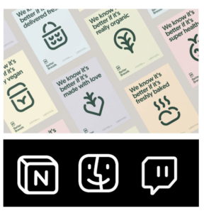
Line drawn icons are everywhere right now, and the more modern trend is to make those lines thick and uniform. This type of icon reduces visual clutter and allows for a fresh, modern look that translates well in a variety of mediums (print, screen, etc.) Design Shack says, “Designed often for single-color applications, these icons are frequently used in white or black on top of color or photo backgrounds.”
5. Emoticons

They aren’t just for texting. Emojis have allowed us to bring and represent emotion (hence, the name) into design. Since the human face is the site of so much information, it’s no wonder these icons, which aim to capture the original source of communication, are popping up everywhere. The shapes featured are instantly recognizable and have universal, or nearly universal, appeal. So they are a smart choice for capturing audience attention quickly.
Using Your Updated Icons
Once you’ve chosen the icon style that works well for you, your next step to make sure you are using them correctly. Skill Share has identified 10 fundamentals of icon design, and we want to share two of the most important with you.
- Consistency: “Because families of icons are valued for their visual cohesion, each icon should be able to function independently while also remaining consistent with the other symbols.” You can accomplish this by making sure your icons have elements of cohesion, like consistent colors, line weight, shapes, angles, lighting, shadows, and so on.
- Scalability: “One of the most important qualities of an effective icon is its ability to make an impact however it’s presented—whether it’s very small or very large—without any change in audience comprehension.” Make sure you view the icon in every size and format it will occur, from a tiny icon on a phone screen to one blown up on a giant screen for a presentation.
These 5 icon trends will help give your presentations and marketing materials a fresh look. They will also help you communicate clearly to audiences who are used to using iconography in their daily lives.
Find out how Ethos3 can help you take your presentation delivery and design to the next level.
