As a college professor and conference speaker, I’ve been using PowerPoint for almost 20 years to deliver content. And with nearly 200 students each giving 3 speeches, I see about 600 new PowerPoint presentations every year. So it’s safe to say that PowerPoint and I have a pretty serious relationship at this point.
But it’s not the same program with which I first fell in love. It has come a long way since it was released by Microsoft in the late 1980s. Users today aren’t locked into boring templates with bullet point lists. Today’s PowerPoint offers a wide range of design features that allow presenters like you and I to create stunning presentations.
Today I’m sharing 7 of my favorite PowerPoint tips with you. Let’s get started.
1. Make Use of PowerPoint’s Design Ideas Feature
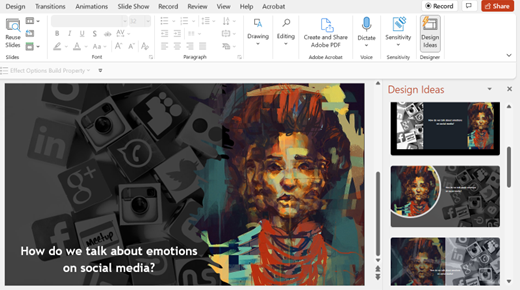
The easiest and fastest way to elevate the look of your slides is to use the constantly improving, AI-powered design ideas feature. It is available to Office 365 users who have PowerPoint 2016 or later. Start by loading the text and any images you want to use onto a blank slide. The design ideas menu will probably pop up to the right. If it doesn’t, just click on the design tab. I used this feature in one of my recent presentations. I wanted to incorporate an image of a painting, a picture of social media icons, and one line of text on my slide. You can see the different options the design ideas feature suggested.
Just be aware that according to the Art of Presentations the design ideas feature may not work if you have mixed elements. For example, if you have “a picture and a rectangle, or a graph and a text box, or an image and graph,” design ideas might not be able to generate suggestions.
2. Give Shapes & Icons Depth
One of my favorite tricks is to use PowerPoint’s glow feature to give shapes and icons depth. Start by uploading your own icon or by choosing one from the insert icon menu. Then, right click on the icon to bring up the format graphic menu. From there, click on the effects menu and select glow. Next, choose the level of glow you want and adjust your color. I’d suggest using a color that is either a couple shades lighter or darker than your icon or your background color. You can see below how it elevates the look of a simple graphic by giving it a little depth.


3. Create Precise Layouts
To make sure your elements are aligned correctly, there are a couple tricks you can use in PowerPoint. First, turn on the gridlines and guides function. To do this, click on the view tab. Then check the boxes next to both gridlines and guides. To make things even simpler, select all of the elements you want to align and then go to the picture format menu and click on align by top, then click on distribute horizontally. That gives you aligned elements which are evenly spaced. No more trying to eyeball it!
4. Save Time with PowerPoint’s Master Slide Function
If you want to apply or adjust design elements across your whole slide deck, the master slide function can help you make a lot of changes fast. Plus, it helps to make sure your design is consistent across the whole slide deck. Click on the view tab and select master slide. This takes you into a separate menu. The slide that you see at the top of the menu bar on the left “talks to” the rest of your slides and controls what happens on them. Here you can change your fonts on all the slides at once. Or you can add a logo to every slide. You can also adjust the color scheme of the entire presentation by changing those items on the master slide.
5. Use the Look & Listen Rule
This tip doesn’t just apply to PowerPoint, but it’s an important reminder for slide design across the board. Remember, a PowerPoint is all about adding visual elements to your message. One of the most confusing things for an audience is when a speaker is talking while also showing words on her slide. Is the audience supposed to listen to you or read the slide? The audience has no trouble listening to you while also looking at clear visuals or simple titles or phrases. But they will get frustrated if you expect them to listen, look, and read a slide with a lot of words all at once. So design slides with more visuals, less words.
6. Incorporate 3D Elements
I recently shared this tip when discussing the pros and cons of 3d presentations, but it’s worth repeating. Adding 3D elements to your PowerPoint presentation can elevate your slide design. PowerPoint has nearly 60 categories full of stock 3D models (in the insert menu, just click on 3D models). If you don’t find what you need there, you can find lots of free 3D model libraries online. To get started with 3D elements in PowerPoint, check out this great beginner’s tutorial video from The Tech Train. Around the 35-minute mark, he explains how to set up 3D elements in PowerPoint.
7. Use PowerPoint’s Morphing Transition
I’ve saved one of my favorite tips for last. The morphing function in PowerPoint is easy to use and can create impressive transitions. For example, say you wanted to use the following graphic to demonstrate 3 key goals for your company in the next quarter.

Instead of simply clicking from one slide to the next, you can have the previous image morph into the specific box/goal that you are focusing on for that portion of the presentation. For a great tutorial on morphing in PowerPoint along with other great tips and tricks, check out Kevin Stratvert’s tutorial here.
These 7 tips can help you elevate your PowerPoint slide designs to create presentations that look professional. For more information on how to take your presentations to the next level, get in touch with one of our presentation experts now.
