When you design your PowerPoint slides for your presentations, it’s common to think in terms of linear sequence. Slide 1 comes before slide 2 which comes before slide 3, and so on. Linear progression makes sense to us. And for good reason. It is tied to the way we write and read. We also think of time as moving on a line (hence the creation of timelines). Even design storyboarding moves through a sequence of chronological squares. Linear progression is part of our lives. Don’t worry, we aren’t asking you to abandon something that makes so much sense.
However, we believe you can elevate your slide design when you think not only of how your slide deck advances forward, but also of how layers can stack up to create depth and beauty as you move forward. Today we’re looking at 3 quick ways to create PowerPoint slides with more depth.
1. Use Textures
Home designers know that layering textures is one of the best ways to make a space feel welcoming. They say, ““If you’re looking to create more visual interest in a room, adding texture is a surefire way to accomplish your goal.” We can use this same principle to add visual interest to our slides. But we aren’t asking you to use a brick or water texture for your slide background. That can look heavy-handed and dated. Instead, opt for more subtle textures that you can layer with color, text, and gradients.
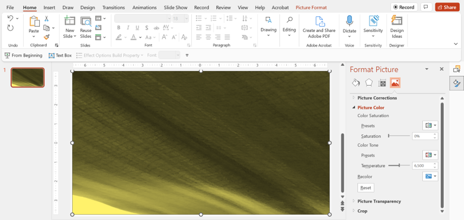
Try creating your own backgrounds simply using your smartphone. In the following slide, I took a closeup picture of a plant leaf (with all of its natural variations and veining) in my office and recolored it using the preset color option on PowerPoint’s format picture menu. It’s a simple way to create one-of-a-kind backgrounds with depth in just a few steps.
 2. Use Gradient Layers
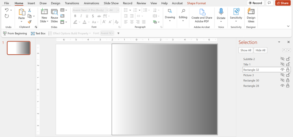
Gradient layers are another easy way to give your slides depth. You can apply them over the full screen or just a portion of it, as shown below. Here we see a box that covers the right 2/3 of the screen that has been set to a gradient fill.
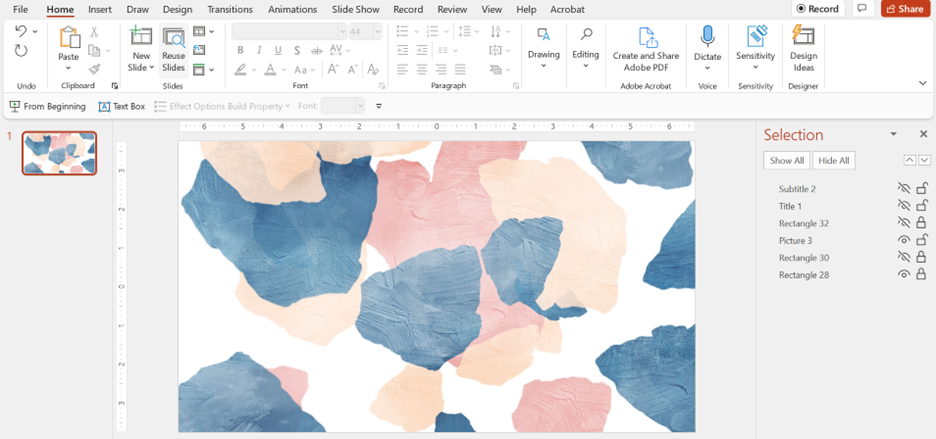
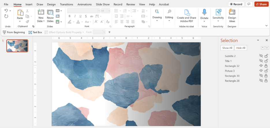
In the following examples, you can see how this gradient box creates depth with a couple different images. All you have to do is play with the transparency of the primary image so that the gradient shows through.
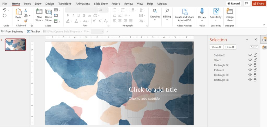
Watercolor Background Without Gradient Layer
Watercolor Background With Gradient Layer
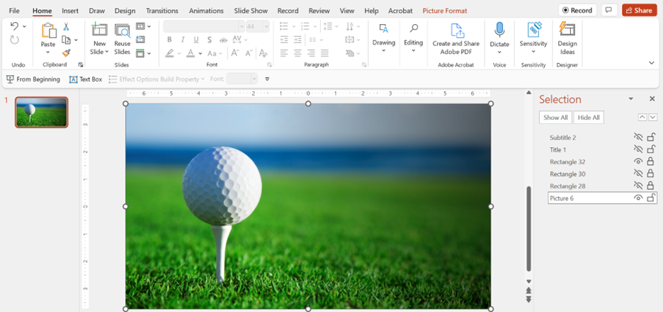
Golf Ball Without Gradient Layer
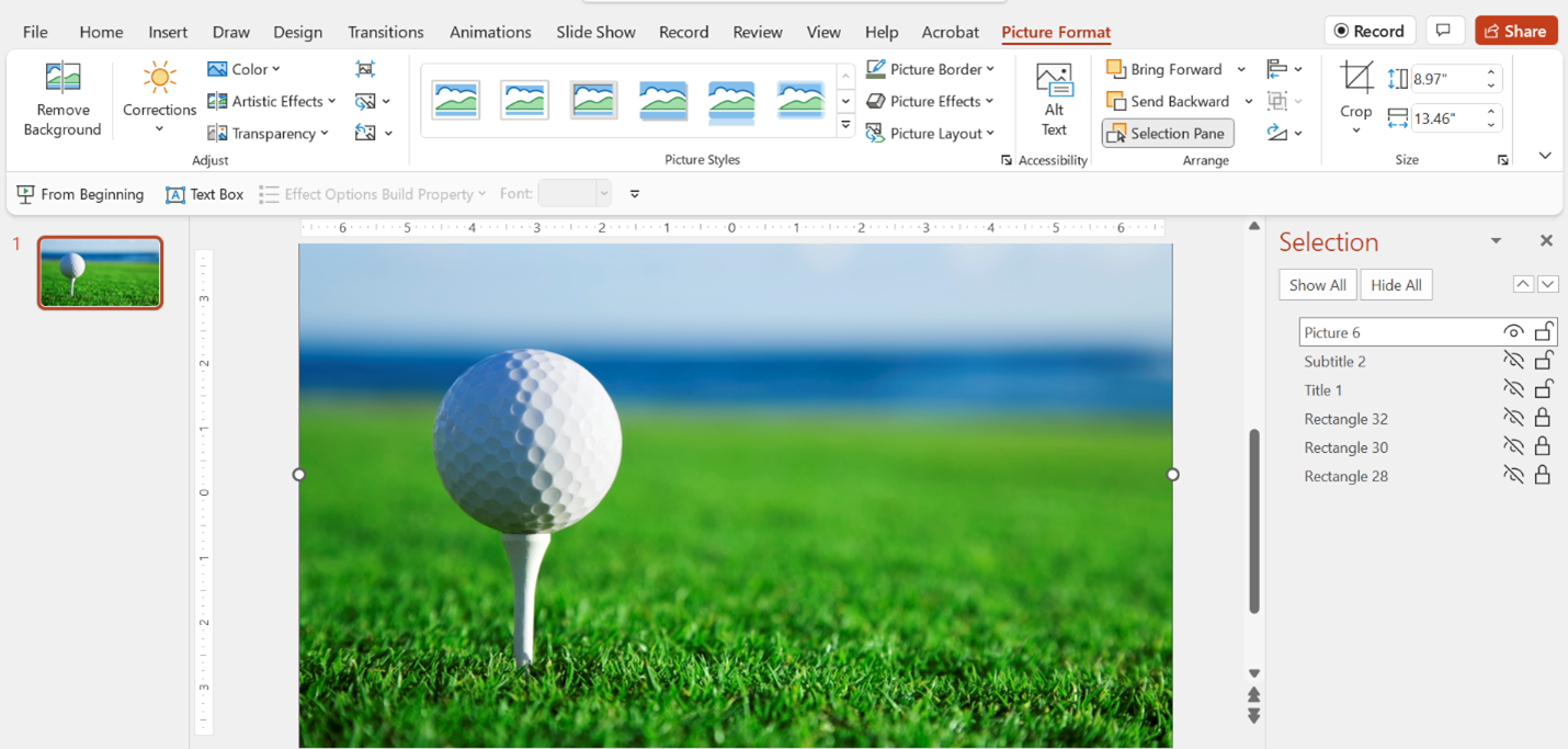
Golf Ball With Gradient Layer
 3. Use PowerPoint’s Design Ideas Feature
Finally, you can make use of preset designs to add depth to an otherwise flat PowerPoint slide. One of the best additions PowerPoint has made to their program in the past decade is their Design Ideas (formerly Designer) function. During its release, the Corporate VP for Microsoft 365 said, “this all works thanks to a powerful combination of automated design and smart image analysis. PowerPoint Designer was built in collaboration with professional graphic designers, who helped develop over 12,000 creative blueprints. Designer applies cloud intelligence to analyze and identify the most compelling portion of your images to determine which blueprints work best with your content.”
The nice thing about these automated designs is that they always include layers of depth—many of which I wouldn’t think to include if I was designing on my own. You can take advantage of these smart design elements easily. First, load a slide with the images, shapes, and text that you want to use. You can see below that I started a simple title slide and added one line of text and one stock picture from PowerPoint’s image bank.
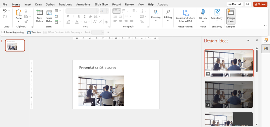 Then, I simply pulled up PowerPoint’s Design Ideas menu, and it began generating ideas for slide layout. I can scroll through hundreds of attractive designs and choose the one that works best for me.
A Tip for Working with Layers: Use the Selection Pane
Once you start adding layers, it can get confusing to work with them. That’s why I recommend using the selection pane function in PowerPoint. Rather than clicking through layers that are hidden behind each other, simply pull up the selection pane menu, so you can see what you are working with.
For example, this fairly simple slide template has a lot of depth and texture, and the selection pane shows there are 6 elements working together to give it that feeling. From this menu, you can also choose to hide/show certain elements which helps show how each layer is functioning. You can also reorder and rename your elements easily.
 As you work on your presentation slides, don’t just think about flat squares in a sequence. Instead, think of layered slides with depth that work together to tell a powerful story.
Want more tips and tricks for creating presentation design that truly wows? Check out our blog, browse our design portfolio, or get in touch with one of our presentation experts now.
