When I need inspiration for presentation design, I look to the art world. I check out what artists are doing. And not necessarily the big name artists, but the everyday creatives like photographers, animaters, and digital painters. These people are the ones who are experimenting and exploring. And they often start the movements that will become popularized design trends.
Adobe’s Behance is one of the best places to drop in to see art in progress and trends in the making. The discover tab takes you to the Best of Behance gallery.
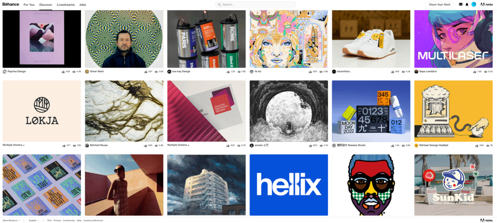 Scrolling through the online gallery reminds me that great presentation design captures the best of art. It draws us in. It delivers a message. And it moves us.
It draws us in with novelty.
I always try to pay attention to what makes me stop scrolling. Is it a color? An image? A bold font?
Whatever it is, it’s always something novel. Researchers Nico Bunzeck and Emrah Düzel found that “when we [encounter] something new, we see it has a potential for rewarding us in some way.” Once a stimulus or an image or an idea is familiar, it “has no reward associated with it and so it loses its potential. For this reason, only completely new objects activate the midbrain area and increase our levels of dopamine.”
So the first job of art and presentation design is to capture our attention with something novel. A lot of things are competing for our attention. Even in a presentation setting, audience members are battling external and internal noise. External noise is anything distracting in the environment (a loud AC unit, distracting décor, uncomfortable seats, etc.). Internal noise is anything distracting within the listener (hunger, thinking about a fight with a spouse, mentally prepping for a meeting later that day, etc.). Great art and presentation design break through the noise by offering something more interesting, something novel.
It delivers a message.
There’s no point in getting someone’s attention if you have nothing to say. And without a clear message, you can confuse and frustrate the audience. Because, ultimately, you’ve just wasted their time. As much I pay attention to what makes me stop scrolling through the Behance gallery, I also pay attention to what makes me start scrolling again. And usually, it’s this: there’s nothing here for me. No new information, nothing attractive, nothing novel. Great presentation design makes sure a slide deck is not only beautiful, but that it offers clear information that is new to the audience.
So if novelty is what stops us in our tracks, the lack of novelty is what returns us to status quo. That means your presentation design needs to maintain a level of novelty throughout. It can’t be one killer opening slide followed by tired templates that everyone has seen before. The brain is too quick to say, “nothing to see here, keep moving.” This means you must have a solid message, some worthwhile content to offer the audience, not just aesthetics. Famous presentation coach and writer Jerry Weissman puts it this way: you can’t have the sizzle without the steak.
It moves us.
While it’s difficult to explain, we all understand the way art can move us. It’s the caught breath, the quickening pulse, the connective feeling that somehow changes us. Research from Emory University says that’s because dopamine is produced and the ventral striatum is activated when we look at art. Our brains feel like they are getting a reward which is why we often feel moved by art in some way.
Great design, like great art, should take the audience somewhere. It should bring them from where they were at the beginning of the presentation to the place you want them to be. This is a culmination of the earlier two steps. First, you catch their attention with your presentation. Then you offer them something valuable and relevant. You elevate their thinking or their experience with what you offer. When you sit down to create your slide deck, ask yourself this: how will this presentation change those who see and hear it?
Take some time now to scroll through the Behance gallery and see what those everyday creatives are doing. See how their work draws you in, delivers a message, and moves you. And then think about how you can emulate that in your own presentation design to create your next masterpiece.
Need the help of a presentation design expert to take your presentation to the next level? We can help. Find out how.
