You’ve got great ideas. Exciting products. A cutting edge company. A compelling story. So a tired 2010 PowerPoint slide template just won’t cut it in 2022. It’s time to update your presentation to reflect current design trends.
We’ve scoured online design sites and recent presentations to compile a list of current presentation design trends. Some of our favorite trends include creative color palettes, less-is-more design, infographics, custom fonts, and original elements. Here’s how to use these trends to freshen up your presentation design.
Creative Color Palettes
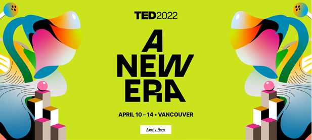
Presentations in 2022 are all about creative color palettes, particularly retro ones. Kimp design company says, “The retro color tones work well in graphic design because they act as standalone design pieces.” One of the more popular retro color palettes gives a nod to mid-century design by featuring muted and earthy rusts, mustards, and greens. And the 80’s are also making a comeback with everything from bold neon to Memphis design elements (think shapes and squiggles). Presentation slide decks in 2022 aren’t afraid to put a new spin on retro color palettes. For example, check out the TED poster for their April conference.
Less-Is-More Design
Presentation designs in 2022 are bold and simple. It’s not about adding more design elements, it’s about making the ones that you use pop. The more you have on your slides, the more everything gets diluted. So slide decks of 2022 keep the focus strong and simple. In other words, slide clutter is out. Remember that the main job of your slide deck is to do what words can’t. In other words, save the words for your talk, and save the slides for everything else. That means you should avoid slides that are all words and instead use a few simple, powerful graphics to back up what you are saying.
Infographics
Granted, infographics have been a design trend for some time now, but they continue to be important elements in slide decks in 2022. Infographics blend words and visuals in a pleasing and easy-to-understand layout. For example, Canva (one of our favorite free design tools) offers infographic templates to help get you started. Check out this one on charity action. The great thing about infographics is that they have layers of information which allow your audience members more individualized interaction with your content. You can get everything you need to know in a quick glance, allowing you to shift your attention quickly back to the presentation. Or, if it’s something that really interests you or something that you don’t quite understand, you can “dive in” further and explore the infographic in more detail.
Custom Fonts
When designing your presentations, don’t skip past font choice. Modern presentations are serious about choosing a font that helps add to the overall tone of the presentation and content. Forget Arial, Times New Roman, and even Calibri. Modern presentation designers know that fonts communicate, too. So what you use matters. Designers often use the mantra “purpose is paramount.” Meaning you have to keep in mind how your audience will be using the text. When choosing a font, ask yourself:
- How large will the screen be?
- What other elements will be on the slide?
- How much text will my audience be reading?
- How long will this slide be on the screen?
- What tone do I want my font to set?
Once you’ve answered these questions, choose a font that is attractive, legible, and interesting without being boring. And don’t be afraid to play around with line spacing, letter spacing, and kerning to help give your font choice some distinction. For some more creative ideas on font selection, check out DesignShack’s list of 2022 font trends.
Original Elements
With the increase in free design and online drawing programs, we are seeing more hand drawn and original design elements in slide decks. Artists like Morgan Harper Nichols have gained incredible popularity in large part due to the ease of creating art with technology and sharing it quickly through social media. Another one of my favorite creatives is Austin Kleon, who describes himself as a writer who draws. His incredible presentations often include hand drawn elements like the one below.
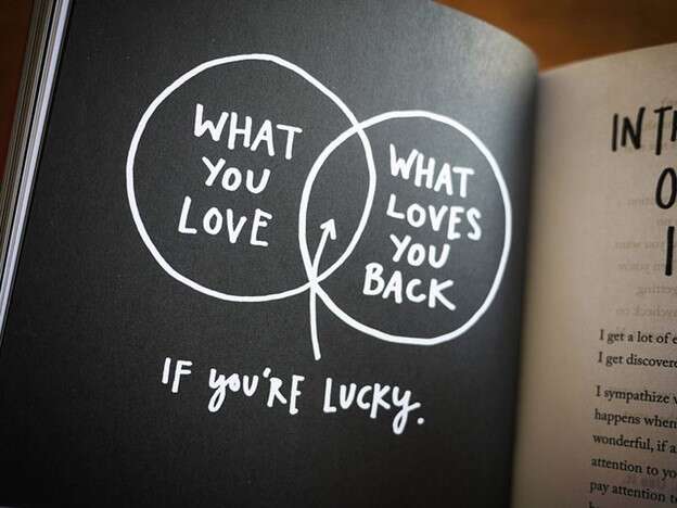
So instead of trying to find the perfect graphic (or font), consider creating one yourself. You might find that your hand drawn element gives your presentation a unique appeal and charm that is right on trend.
Embracing Design Trends
Outdated presentation designs aren’t doing you any favors. If your slide deck looks outdated, you risk the audience thinking your ideas are outdated, too. But when you update your presentation design to reflect some or all of the trends listed above, you can build energy around your presentation and ideas.
Need help creating a fresh, new presentation or updating a current one to reflect modern design trends? We’ve got you.
