No two individuals have the same style of handwriting. Some people’s handwriting is easier to read than others. Some put space between each letter of a word, while others barely allow their letters to breathe. A 2013 study found that many of our personality traits come out in our handwriting style. The richness and depth of handwriting has captivated designers for ages – with the first Script typeface produced in 1643. Despite the centuries of adoration of the Script typeface, many presenters struggle with using it in their presentation design. If you’re grappling with a similar issue, ask yourself the following questions:
What is the importance of legibility?
If every word included within your presentation slides is absolutely crucial to relaying your message, you should definitely avoid scripts. On the other hand, if there are particular words that you want your audience to pay attention to, we would suggest using a Script typeface. By making the word or words less legible, you encourage audience members to put some effort into receiving the information. This could enhance their ability to retain the message after your presentation.
Presentation Tip:
Script typefaces are best used for headers or short areas of text. When thinking about your presentation design, evaluate those sections that you could feasibly show in script. Try implementing a Script typeface for the content in a section header – emphasizing your main points.
What is the tone of your presentation?
Scripts have the capacity to convey sophistication and grace; playfulness and fun; elegance and delight. Although handwriting varies from person to person, Script typefaces fall into two categories: Formal Script and Casual Script.
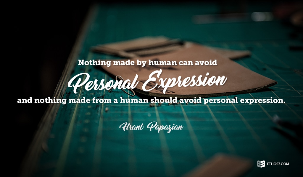
“Nothing made by human can avoid personal expression, and nothing made for a human should avoid personal expression.” – Hrant Papazian
Determine the tone you want to strike with your presentation content and align that with your presentation design.
Presentation Tip:
When working on client projects, the Ethos3 design team likes to use Script typefaces in decks that share two primary qualities – heavily illustrated and playful tone. Experiment with your next presentation by opting for illustrative components over stock photography. Complement the illustrations with a Script typeface.
What is the overall design scheme?
A presentation designer must remain mindful of the design elements he or she plans to include in the presentation design. These elements should always serve to advance the following design principles: proportion, perspective, balance, emphasis, movement, pattern, repetition, rhythm, variety, harmony, and unity. Whatever Script typeface you choose, ensure that the way you utilize it serves a greater design purpose.
Presentation Tip:
Our team of designers swear by the power of the script to add a level of visual interest to a slide. Here’s how they used a Script typeface in a recent project for Sandisk:
The Script typeface selection in PowerPoint is not extensive enough to fulfill all designers needs. We recommend visiting either FontSquirrel or LostType for free scripts to download and integrate into your presentation design.
Contemplate legibility, tone, and design scheme when debating whether or not to use a scripts in your deck. To discover more about presentation design, read these articles:
Why PowerPoint Design Skills Still Matter
5 Must-Read Books for Presentation Design Enthusiasts
Iconography Guide for Your Presentation Design