How many infographics have you seen in your lifetime?
When you start to consider it, the numbers climb. Think back on a few of your favorites, or even the design category as a whole. Most infographics feature bold numerical data, a single theme, icons/illustration, and are laid out in a long vertical column that you can easily scroll down.
For a design company, this format is tried and true. We’ve probably made hundreds of infographics for internal marketing projects and clients. It’s not that we reached a breaking point per se, but rather that we wanted to experiment with something a little bit different for a broad marketing project to reach a top-of-the-funnel audience.
(As a reminder, top-of-the-funnel audiences are the general mass of bored clickers, browsers, question askers, and searchers online.)
Enter Tom Ka Gai Soup:
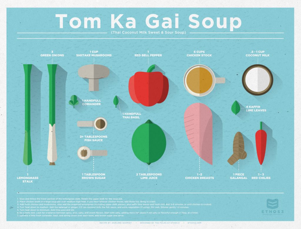
This is one of our favorite design projects that we’ve ever created, and a good example of what “thinking outside of the vertical box” can accomplish. Why does this piece work so well for our marketing efforts, and how can you capture some of that magic for yourself?
Goodbye, vertical style!
The long, horizontal layout of this piece creates a way to show each ingredient in one glance. We love that this challenges the traditional style of an infographic and leaves viewers with the sense that they haven’t seen anything like it before. If you want to capture some of this mojo, what design standards can you challenge in things you commonly produce? How can you change up social media banners, one sheets, and blog images on your site?
Custom illustration
Icons are a staple of design these days. You see them everywhere, bundled together in packs by topic or style. But it’s custom illustration that makes this piece so spectacular, moving away from small icons and large numerical values found in regular infographics. The paper, cut-out style of Tom Ka Gai Soup looks eye-poppingly unique. If you can, use custom illustration wherever possible in your marketing assets to stand out from the crowd.
A topic we <3
One way to freshen up your design assets and create pieces with much more authenticity is to choose a topic that you love to create a piece about it. In this case, one of our designers used their lifelong love of this particular soup to develop a tasty, fun piece. If you care about the subject you’re creating, you will naturally work harder to improve the design and think outside of the box. Don’t just “phone it in,” create something you can be proud of.
It’s not often that we get to flex our design muscle “just for fun,” but when we do, the result is always something great. In fact, we’re so proud of Tom Ka Gai Soup that we printed it out and have it framed and hanging in our kitchenette. When is the last time you created something worthy to be hanged in your kitchenette? Take some inspiration from us and get started!
Want to read more behind-the-scenes stories from our broad portfolio? Check out these related articles:
Inspiration From Everywhere: The Story of Our Nashville Deck
Blinded By Science! The Story of “The Mega-Might of Presentations for Content Marketing”
Inspired by Rocky: The Story of Our B2B Marketing Presentation

